Lola’s
Annisa, Gramercy Tavern, Untitled… Chef Suzanne Cupp’s resume reads like a best-of list of NYC dining. But when it came to opening her first independent restaurant, this lauded chef was seeking an opportunity to bring a new layer of personal introspection to her cooking. Drawing inspiration from her Asian-American heritage, Southern upbringing and storied life in professional kitchens, Lola’s is an ingredient-driven concept that defies standard culinary categories.
In bringing together these multifaceted influences, we were challenged to create a playful, slightly feminine brand that represents the synergy and evolution of Suzanne’s 15+ years as a chef. From brand messaging and logo design, to website design and printed materials, this 360° brand concept beautifully establishes Suzanne’s unique perspective, while leaving plenty of room for her ongoing creative evolution.
LOCATION
New York, New York
PROJECT SCOPE
Logo Design + Visual Branding
Brand Positioning + Copywriting
Website Design (In Progress)
Printed Materials
Photography Guidelines
COLLABORATORS
Oyster Sunday, Project Management
Liz Clayman, Photography

The Opportunity
The definition of a “chef’s chef,” Suzanne has been quietly celebrated among her peers for most of her career. However, making a splash as a restaurateur was a new opportunity for this veteran of NYC dining. As one of the most anticipated small restaurant openings of spring 2024, getting the brand storytelling right (before the press created an alternative narrative) was an essential part of Lola’s opening process.


The Challenge
As a Filipino-American female chef naming the restaurant “grandmother” (Lola) in Tagalog, it was important to Suzanne that her menu and concept not be misconstrued as “a Filipino restaurant”. Rather, she draws inspiration from a wide range of ingredients and techniques, and any Asian dominance in the flavors is moreso due to the chefs she worked with over the course of her career. Clarifying the nuances of these influences was thus a delicate balancing act, as we sought to establish a brand that felt authentic to Suzanne as an individual with a complex, layered perspective.
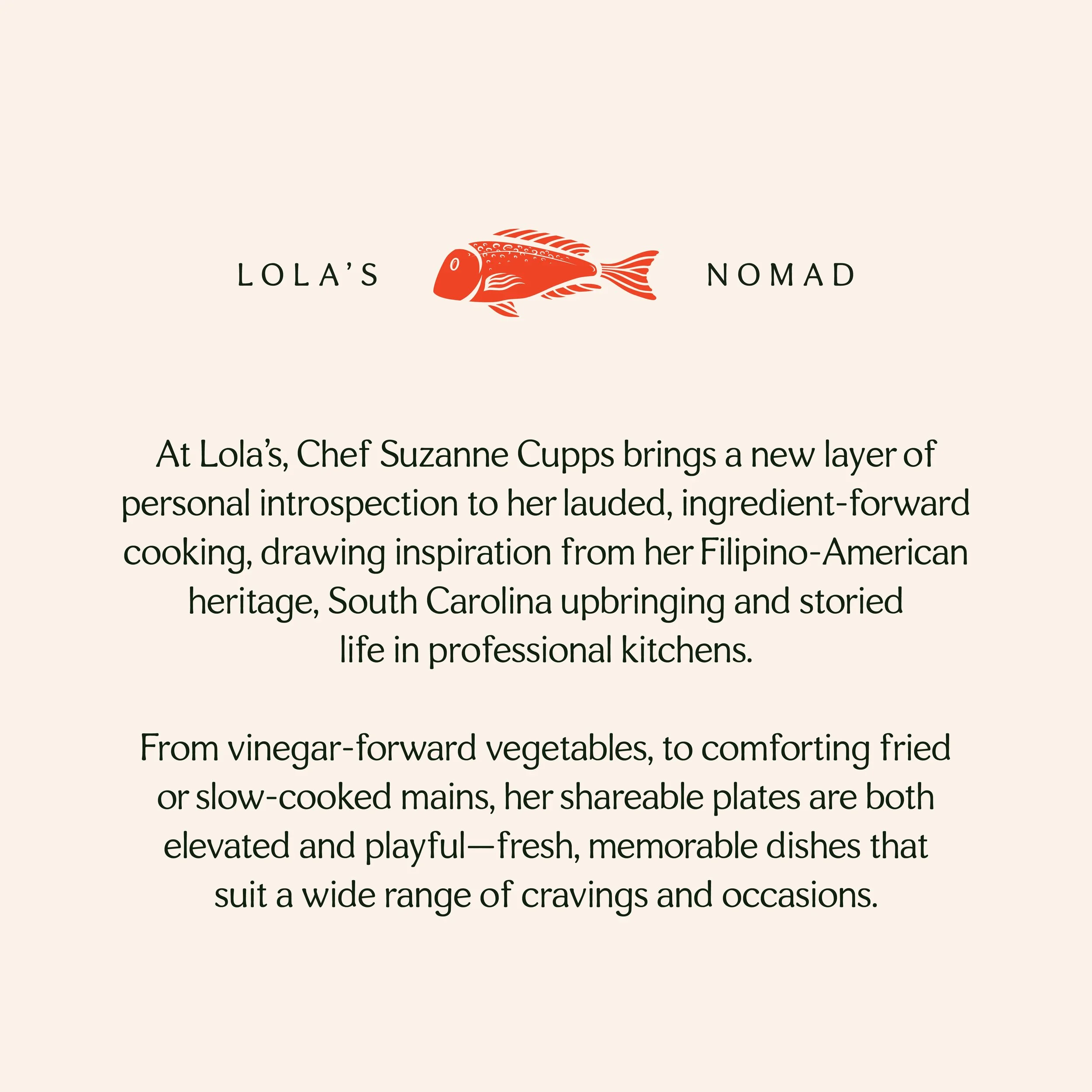
Custom Illustrations
While Suzanne wanted the font and color palette of the brand to remain largely neutral, the complementary illustrations used in her logo were an opportunity to highlight one of the most important aspects of her cooking: a focus on ingredient sourcing. Leaning into a modern woodblock print style that aligned with the Asian-leaning flavors of her menu, we chose to highlight three ingredients (carrots, fish, cabbage) that frequently appear in Suzanne’s cooking.
