
Harvey Park Farmers Market
THE BRIEF
Channel the mid-century modern aesthetic of the Harvey Park neighborhood to develop a hip yet inviting brand identity. Distinguish the brand from other Denver-area greenmarkets through the use of eye-catching illustrations showcasing actual products that are frequently grown in the region.
LOCATION
Denver, Colorado
SCOPE
Brand Identity:
Logo Design
Custom Illustration
Brand Guidelines
Brand Assets:
Squarespace Website Design
Print + Digital Collateral
Email Marketing
The Opportunity
Despite the rapid growth of seasonal farmers markets in the Denver area, Harvey Park local Allie Bronston found herself regularly traveling 30+ minutes to purchase greenmarket produce. The markets she did visit were often overcrowded, signaling that a new Southwest Denver market would likely become a beloved resource. By investing in bold design that felt integral to the neighborhood’s identity—rather than treating branding as an afterthought—we were able to establish a strong sense of story from day one.
The Challenge
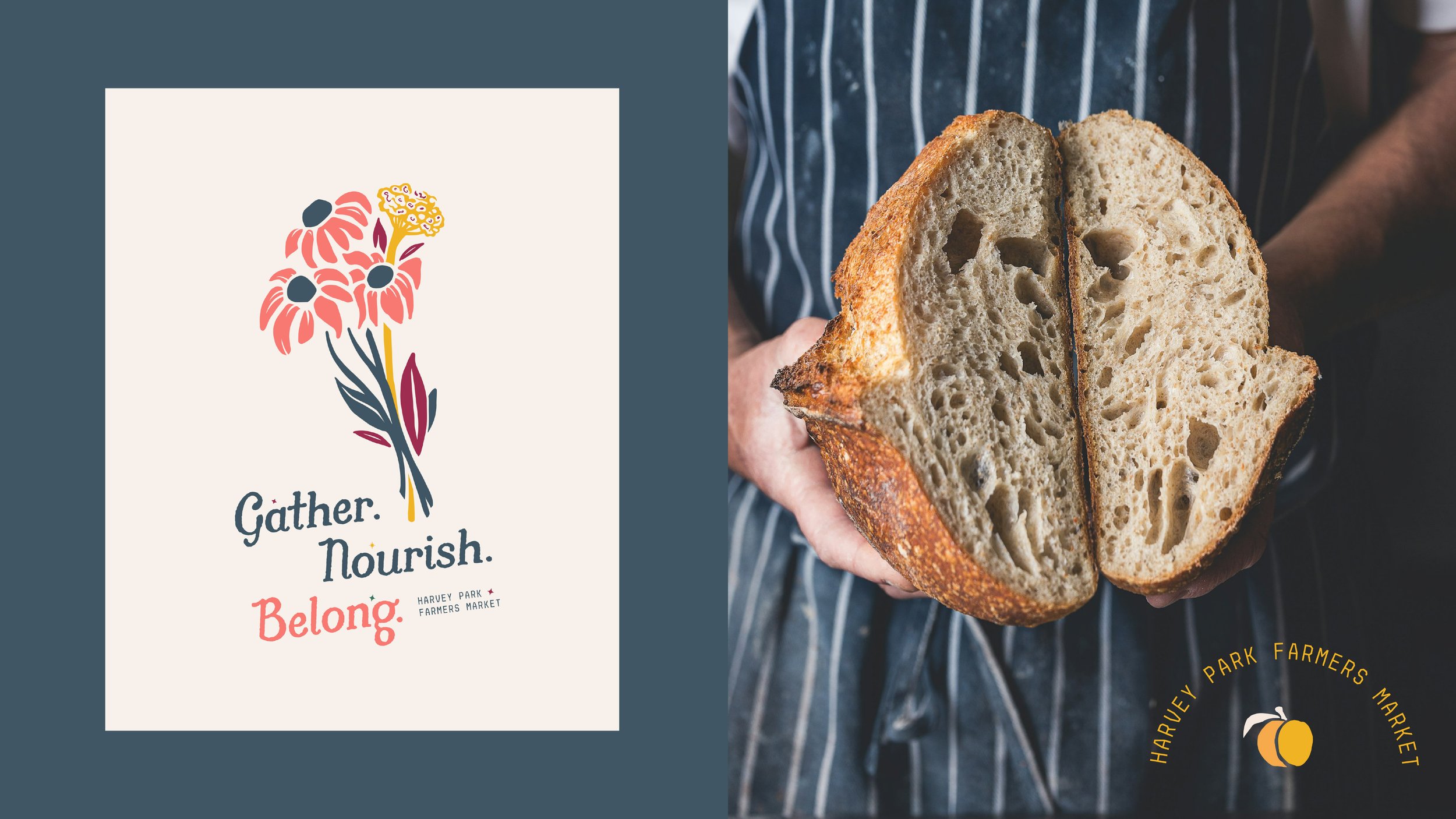
With so many markets already in existence in the Denver area, the founding team wanted to ensure a clear sense of differentiation. Through the use of funky fonts, retro colors and hand-drawn illustrations—as well as tiny starburst accents that nod to mid-century modern visuals—we were able to establish a bold aesthetic that felt both locally rooted and design-forward.

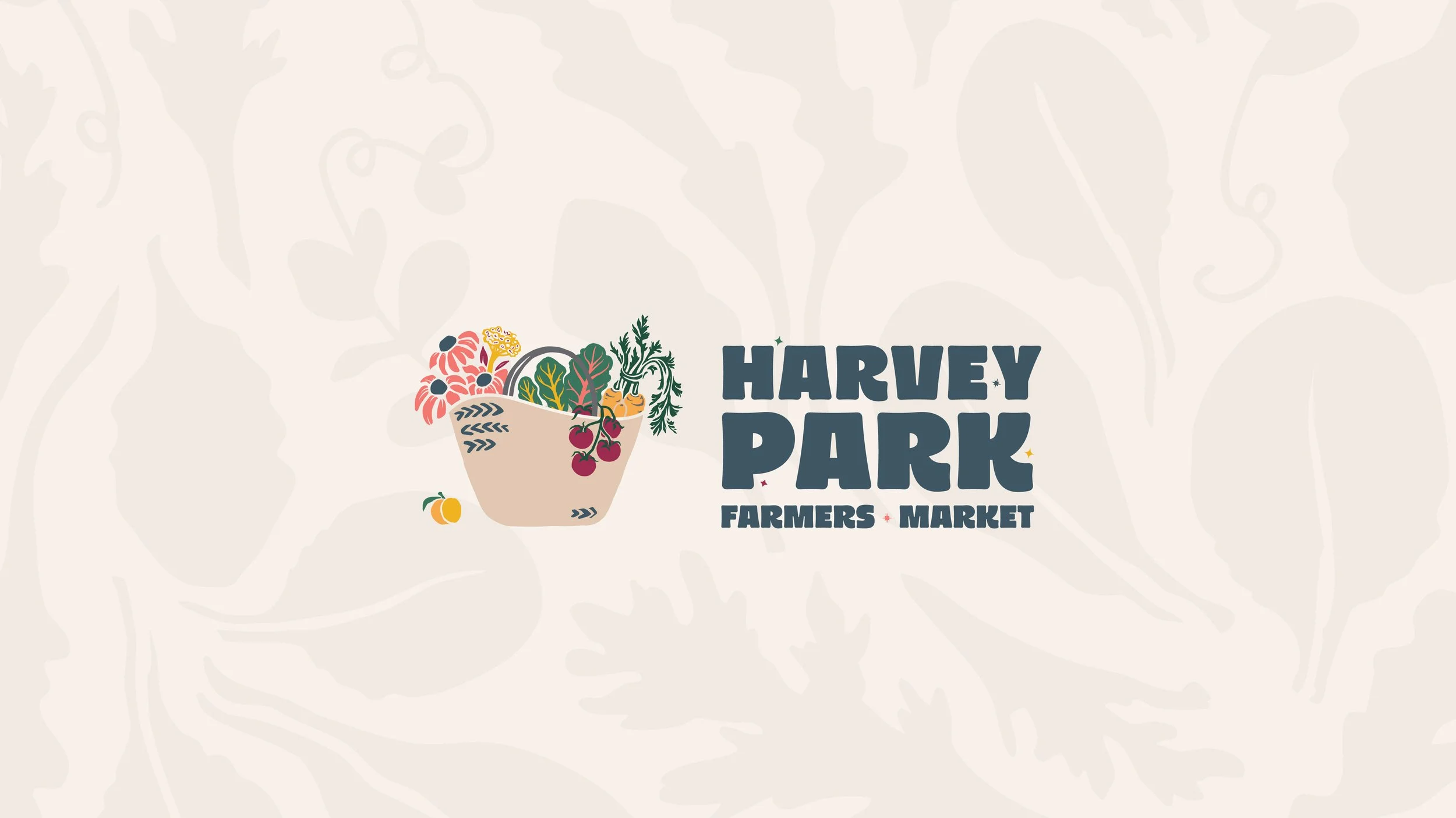
The Illustration
In developing the playful aesthetic of our illustration style, we also sought to avoid common greenmarket tropes. We strategically decided to showcase the market bounty within a woven basket, allowing for a greater variety of products to express a sense of abundance. We also developed an energetic pattern of small leaf greens (arugula, spinach, radicchio, pea tendrils + mustard greens), in an effort to bring a sense of movement to the brand storytelling.

KIND WORDS
“We were new to brand creation and website design as we embarked on launching the Harvey Park Farmers Market, and Lauren's expertise was invaluable. She hit the mark in terms of the style and vibe we were hoping for, and her talent is clear in the incredible logo and emblems she created for our brand. Lauren is thoughtful, kind, smart, and responsive, and has her design process dialed in.”