

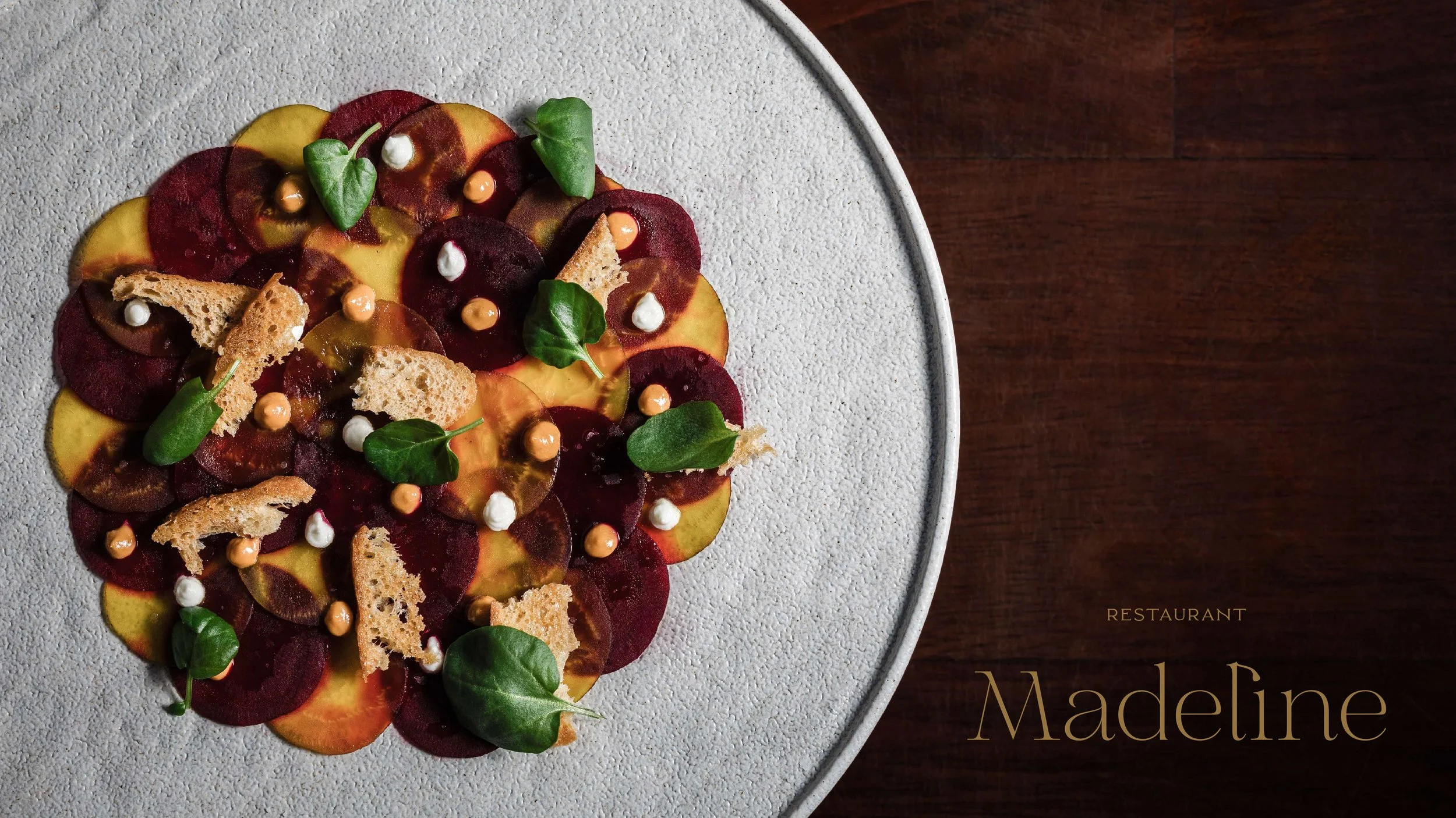
Restaurant Madeline
THE BRIEF
Develop a comprehensive, differentiated brand identity for Chef Quincy Cherrett’s first independent full-service restaurant. Focusing on timelessness over trends, this concept should balance a sense of familiarity and tradition with modern culinary creativity.
LOCATION
Denver, Colorado
SCOPE
Brand Identity:
Messaging
Logo Design
Custom Illustration
Brand Guidelines
Brand Assets:
Website Design + Content
Print + Digital Collateral
Photography
The Opportunity
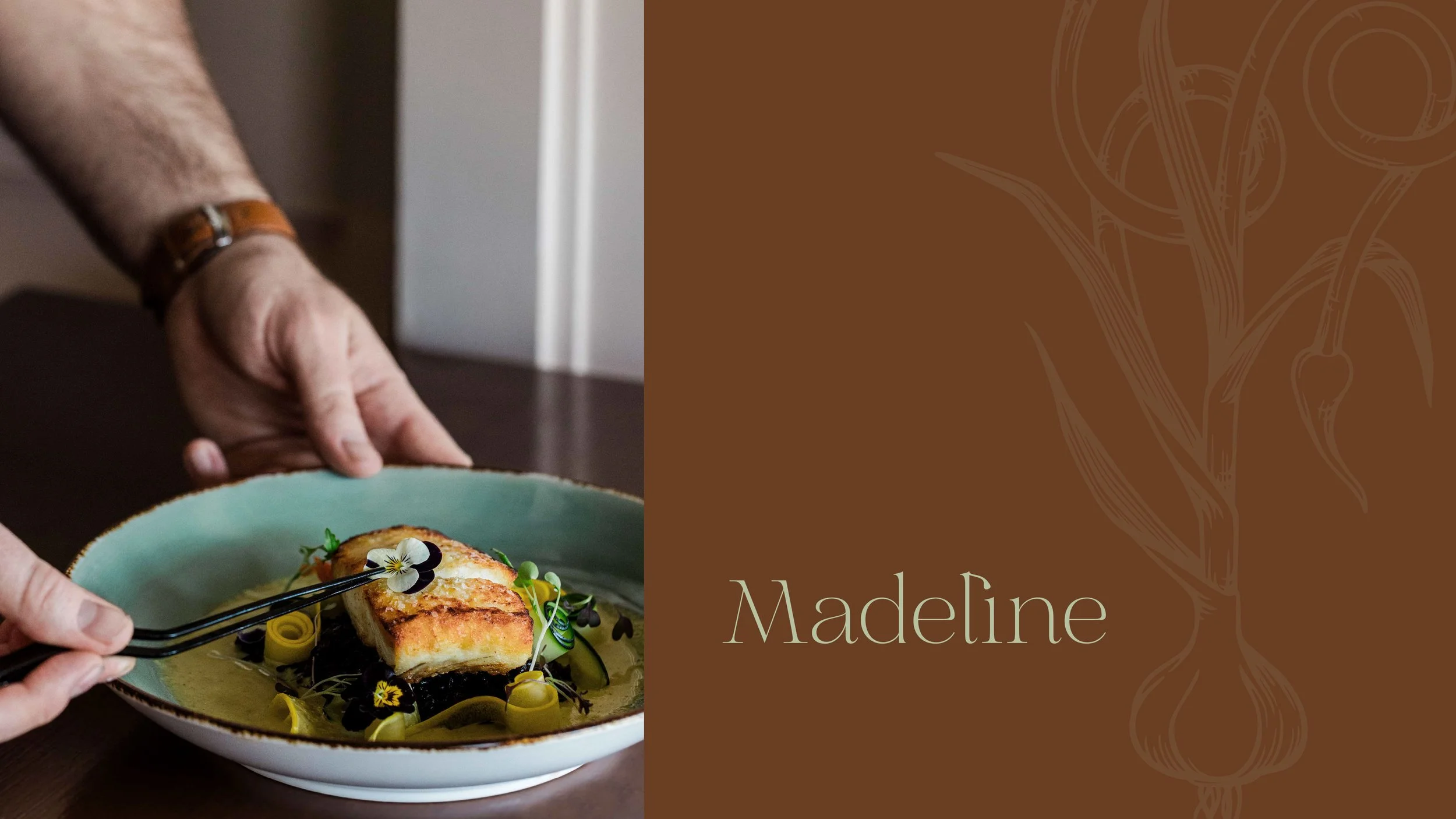
After running an independent food stall in a market hall for several years, Chef Quincy was returning to the world of full-service restaurants. Having secured one of Denver’s most iconic restaurant spaces, his focus was to create a concept that was ambitious enough for destination dining, while focusing on an ambiance and style of service that would cultivate a loyal regulars crowd.
The Challenge
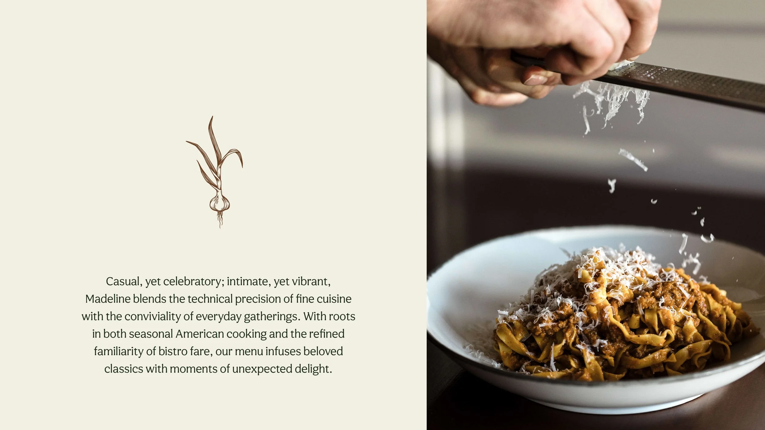
While Chef Quincy’s style of cooking draws from broad global flavors and techniques, both the name for this concept (which honors Chef Quincy’s niece) and the bistro-style menu risked to be perceived as “French.” It was essential in our messaging that we clearly define the culinary style, while still leaving room for the natural evolution of the menu over time. Similarly, in crafting Chef Quincy’s bio, we sought to draw strongly on his upbringing in hospitality alongside his diverse restaurant experience, establishing a sense of credibility without assigning narrow labels to his vision for Madeline.
The Logo
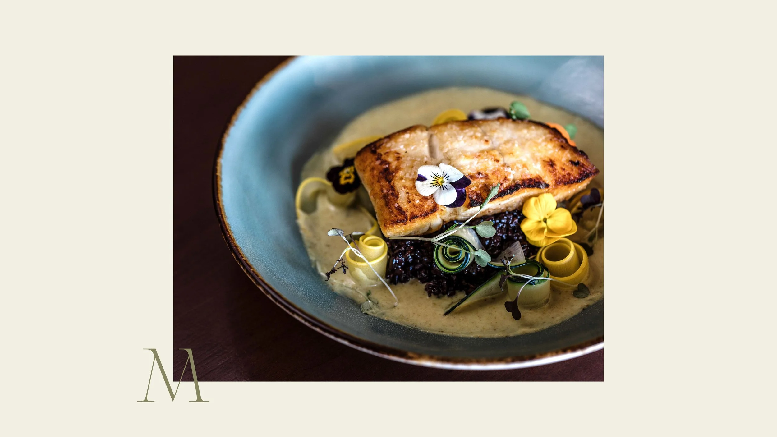
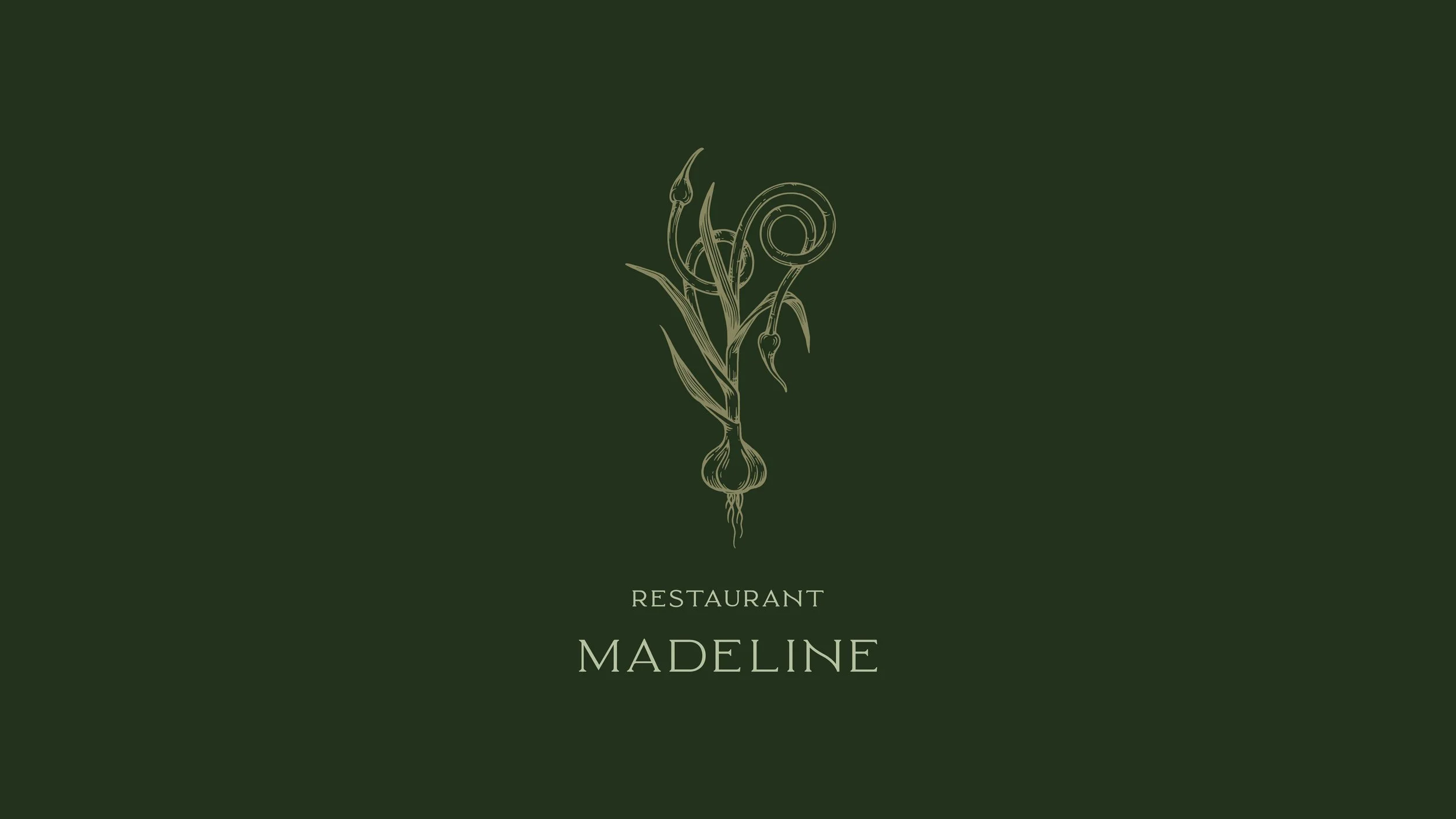
As this collaboration progressed, it became clear that Chef Quincy drew inspiration from beautiful, but lesser-known ingredients like garlic scapes and borage flowers. We selected the former for its looping organic structure and strong association with hyper-seasonal sourcing, creating a single illustration that could be broken into a series of smaller parts. In selecting (and finessing) the complementary font, we sought a sense of old world beauty balanced with modernism—something that felt elevated, but also approachable. The resulting visual identity reflects Chef Quincy’s creative sensibilities, while evoking a broader sense of timeless good taste.
KIND WORDS
“We had an incredible experience working with Cognoscenti Creative on our restaurant branding. Their process was thoughtful, intentional, and genuinely collaborative. They took the time to really understand our vision and values.
The end result is beautiful, cohesive branding that feels perfectly aligned with who we are. We’re so grateful for their care and creativity to help bring our brand to life.”