
Rosa’s Diner
THE BRIEF
Create a nostalgic, energetic brand for a modern diner concept in the Moxy Hotel. Ensure that the project speaks to leisure and business travelers, as well as the downtown DC workforce. Collaborate with the client and project teams to shape the creative direction for both branding and interior design, keeping in mind a tight timeline and budget for the spatial renovation.
LOCATION
Washington, DC
SCOPE
Brand Development:
Market Research
Positioning
Brand Identity:
Tagline
Messaging
Logo Design
Custom Illustration
Brand Guidelines
Brand Assets:
Print + Digital Collateral
Signage

The Opportunity
After launching an upscale seafood concept that didn’t resonate with the hotel’s guests or DC locals, the owners of this Moxy property were looking for a more approachable, social concept to complement the hotel’s existing rooftop cocktail bar. We were presented with the team’s plans for a Latin-influenced, all-day diner, and were asked to spearhead general creative direction to ensure the concept would appeal to the diverse audiences drawn to nearby offices, tourist attractions and conference centers.
The Challenge
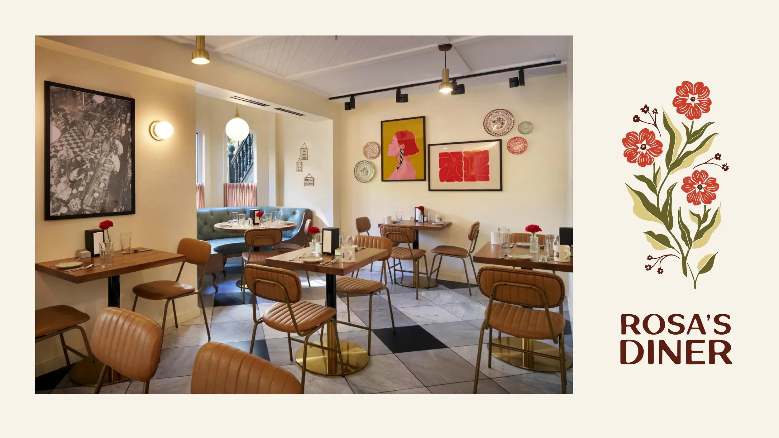
While a slew of renovated diners and roadside motels have driven a wave of concepts that speak to Americana nostalgia, we wanted to ensure this concept would transcend the trends that inspired it. We also wanted to ensure that the broad Latin influences on the menu would not be misconstrued as “Mexican”. With that in mind, we recommended that the client lean into the feeling of a locally rooted family-owned establishment, rather than colorful, maximalist kitsch.
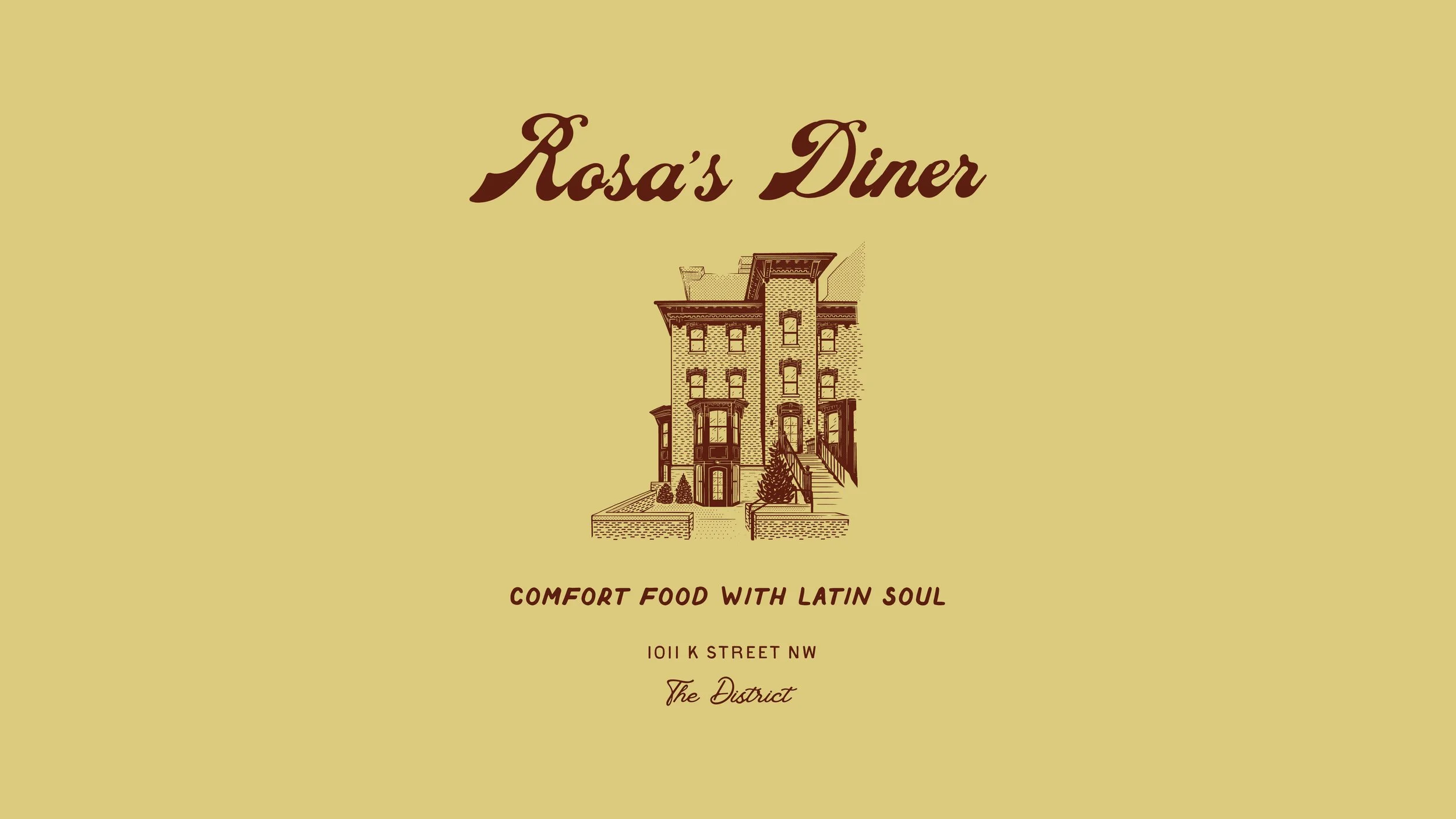
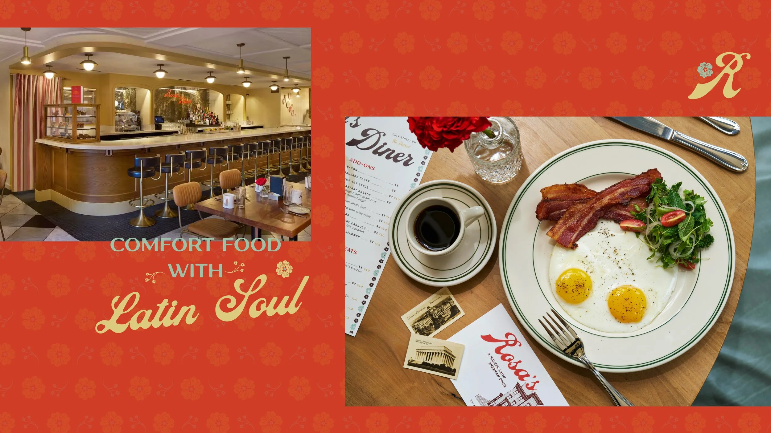
The Illustration
While a historic DC row home may be an unconventional location for a diner, the iconic architecture of the building was something we wanted to leverage within the brand design. In turn, we created a custom illustration that could be incorporated into the concept’s menu and merch design—transforming what could have been a storytelling constraint into a meaningful asset. At the same time, we referenced the Latin aspects of the menu through a two-dimensional flower pattern that was also broken into smaller elements in the logo design. As with the entire project, these elements were carefully calibrated to emphasize Americana nostalgia with a more subtle touch of Latin flavor.
KIND WORDS
“Working with Cognoscenti Creative on the branding for one of our F&B projects was an exceptional experience. From the outset, their team took the time to thoroughly understand our vision, the property's unique story, and our business goals. Their strategic approach, creativity, and attention to detail resulted in a brand identity that truly captured the essence of the hotel.
What impressed me most was their collaborative process. They were incredibly receptive to feedback, welcomed discussion, and thoughtfully refined ideas throughout the project while still bringing fresh perspectives and creative solutions to the table. Every deliverable was well-considered, polished, and aligned with our objectives.
Beyond their talent and expertise, the team consistently went above and beyond. Their responsiveness, professionalism, and genuine investment in the success of our project made them feel like an extension of our own team. It's rare to find a creative partner who combines strategic thinking, storytelling, design excellence, and outstanding client service so seamlessly.
I would highly recommend Cognoscenti Creative to anyone looking for a branding agency that is thoughtful, creative, collaborative, and deeply committed to delivering exceptional results.”
ASHLEY BRINKLEY