

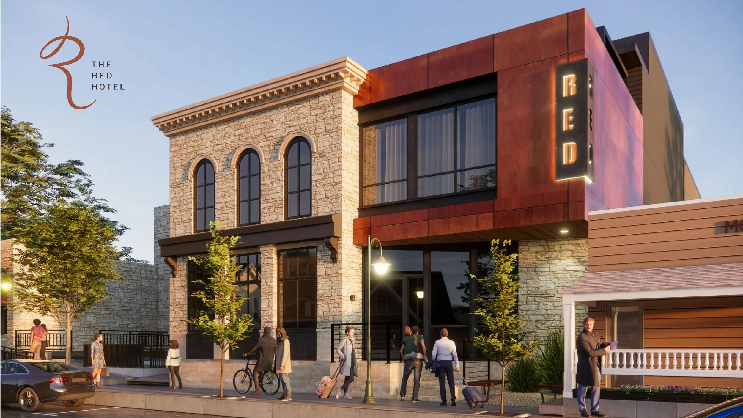
The Red Hotel
THE BRIEF
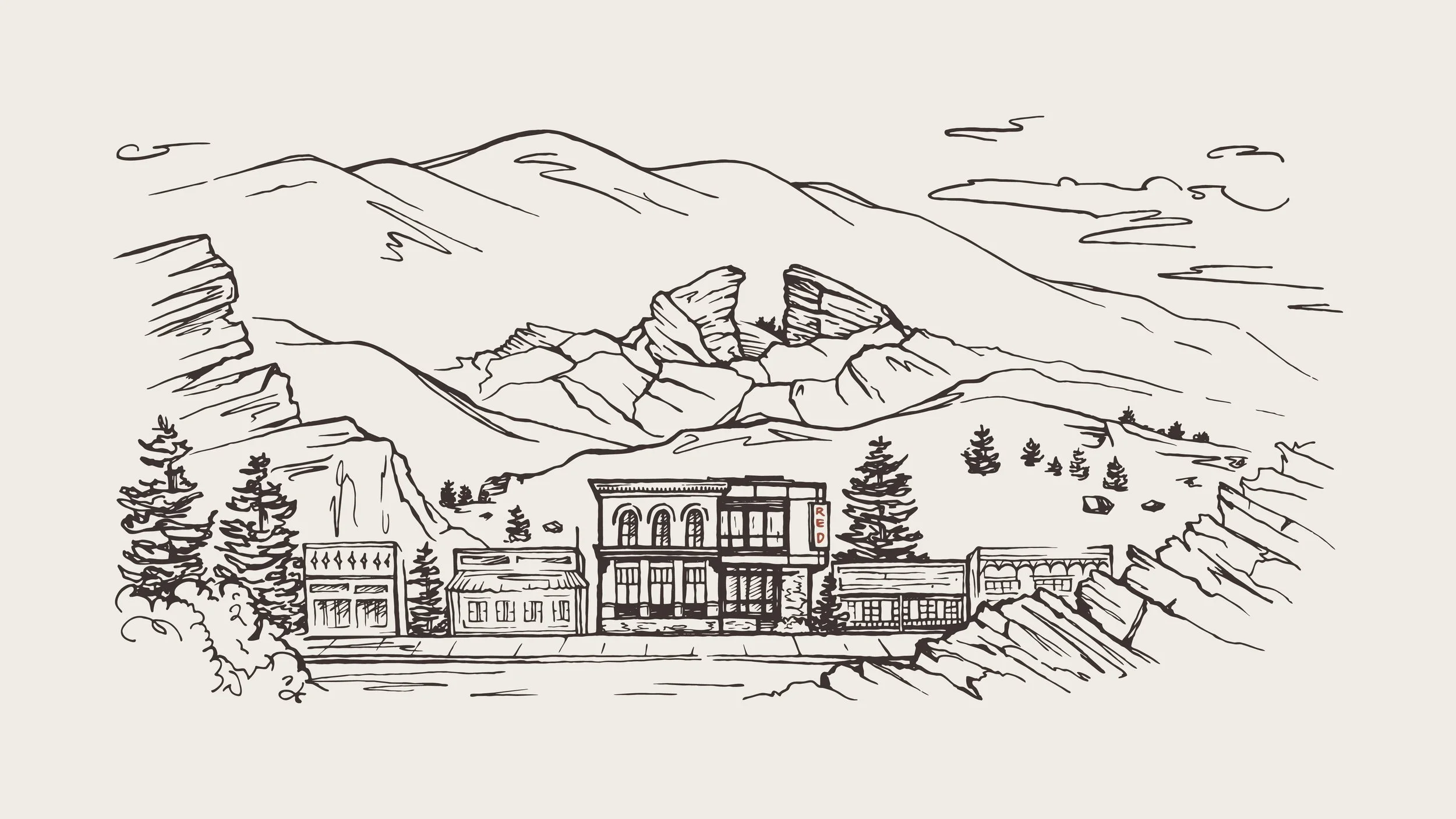
Create an elegant, yet approachable brand that speaks to the stunning landscape and dynamic experience of life in the Foothills. Ground the property in its proximity to Red Rocks Amphitheater, while establishing a broader sense of Morrison’s unique charm within the Denver metro area. Finally, consider the hotel’s impact on the local community, ensuring a sense of synergy with the needs and interests of local residents, in addition to travelers.
LOCATION
Morrison, Colorado
SCOPE
Brand Development:
Market Research
Positioning
Brand Identity:
Taglines
Messaging
Logo Design
Custom Illustration
Brand Guidelines
The Opportunity
While Morrison has long benefitted from the draw to Red Rocks Amphitheater, an elevated hotel project had yet to be executed in the center of town. As local architects and designers, the intrepid founders of this project had invested an outsized effort in getting the project approved—envisioning not only a unique lodging concept, but also a “front porch” for the local community through a ground floor coffee shop and publicly accessible rooftop.
The Challenge
As local Foothills residents and first-time hotel owners, the team’s investment in the project was both personal and professional. With four opinionated co-founders, it was essential that we use our positioning process to align and focus their varied perspectives. Building on the core values and clear brand direction established in this strategy phase, we returned consistently to the guest experience and the opportunity to engage the local community as a counterbalance to the team’s individual talents and points of feedback.
Experience-Driven Storytelling
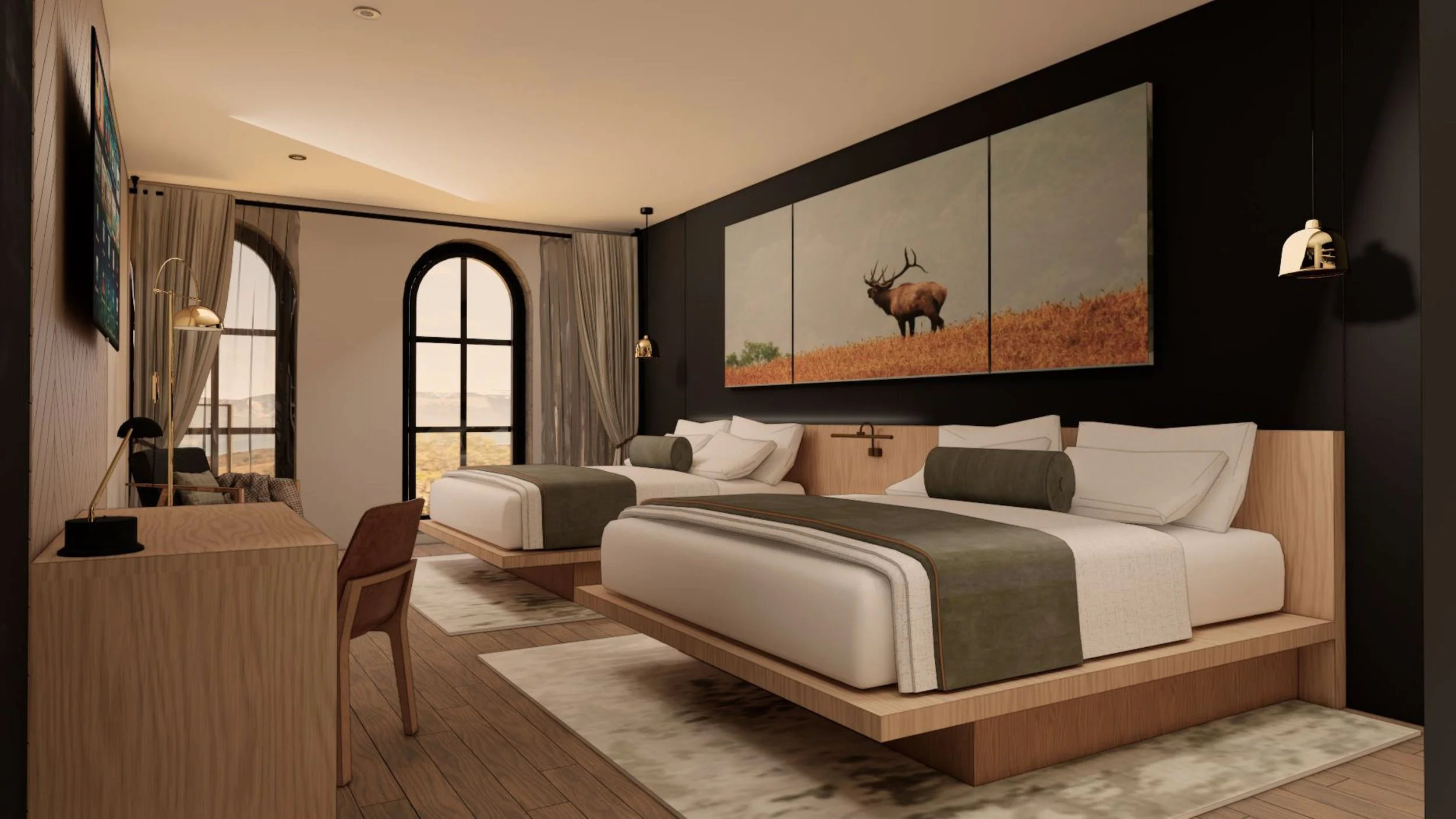
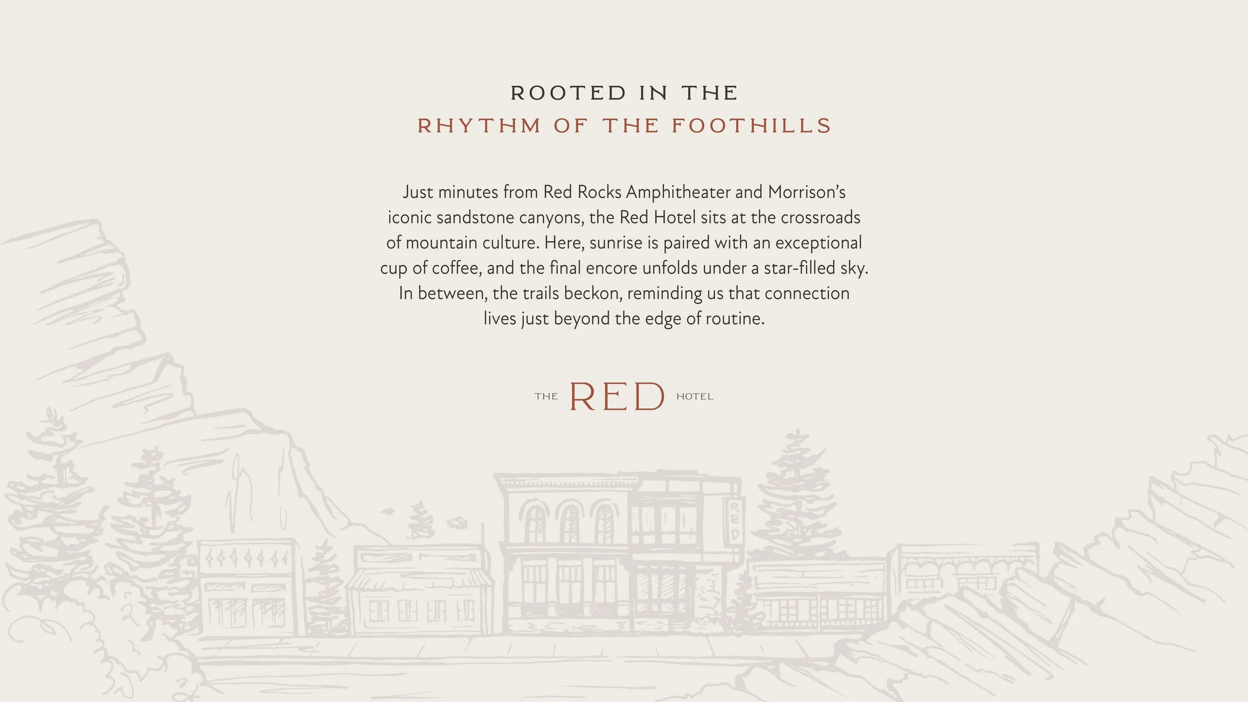
While the proximity to Red Rocks would always be a primary driver for this property, the team felt strongly about building a brand that offered more than just luxury and convenience. As a result, our copywriting focused on evoking the adventurous, yet grounded lifestyle of Morrison residents—inviting guests to take a deeper interest in the landscape and community of the surrounding Foothills.
KIND WORDS
“From the beginning, Lauren and Carly brought creativity, clarity, and strategic insight to the process. They took the time to understand the spirit of Morrison and translated it into a brand that feels authentic, modern, and memorable. Every detail—from the visual identity to the overall brand story—was thoughtfully crafted and beautifully executed.”