
The Whit
THE BRIEF
Research and develop a distinct, yet cohesive brand identity for a multi-faceted property encompassing a 15-room hotel, elegant indoor-outdoor event spaces and an onsite coffee / tea / cocktail salon. Housed within a landmark Garden District mansion, this concept should be rooted in the neighborhood’s history—distinct from that of greater New Orleans. This brand should also speak to a mix of travelers and locals, while striving to balance the impressive stature of the building with a sense of genuine Southern hospitality.
LOCATION
New Orleans, Louisiana
COLLABORATORS
Oyster Sunday, Project Management
Logan Killen, Interior Design
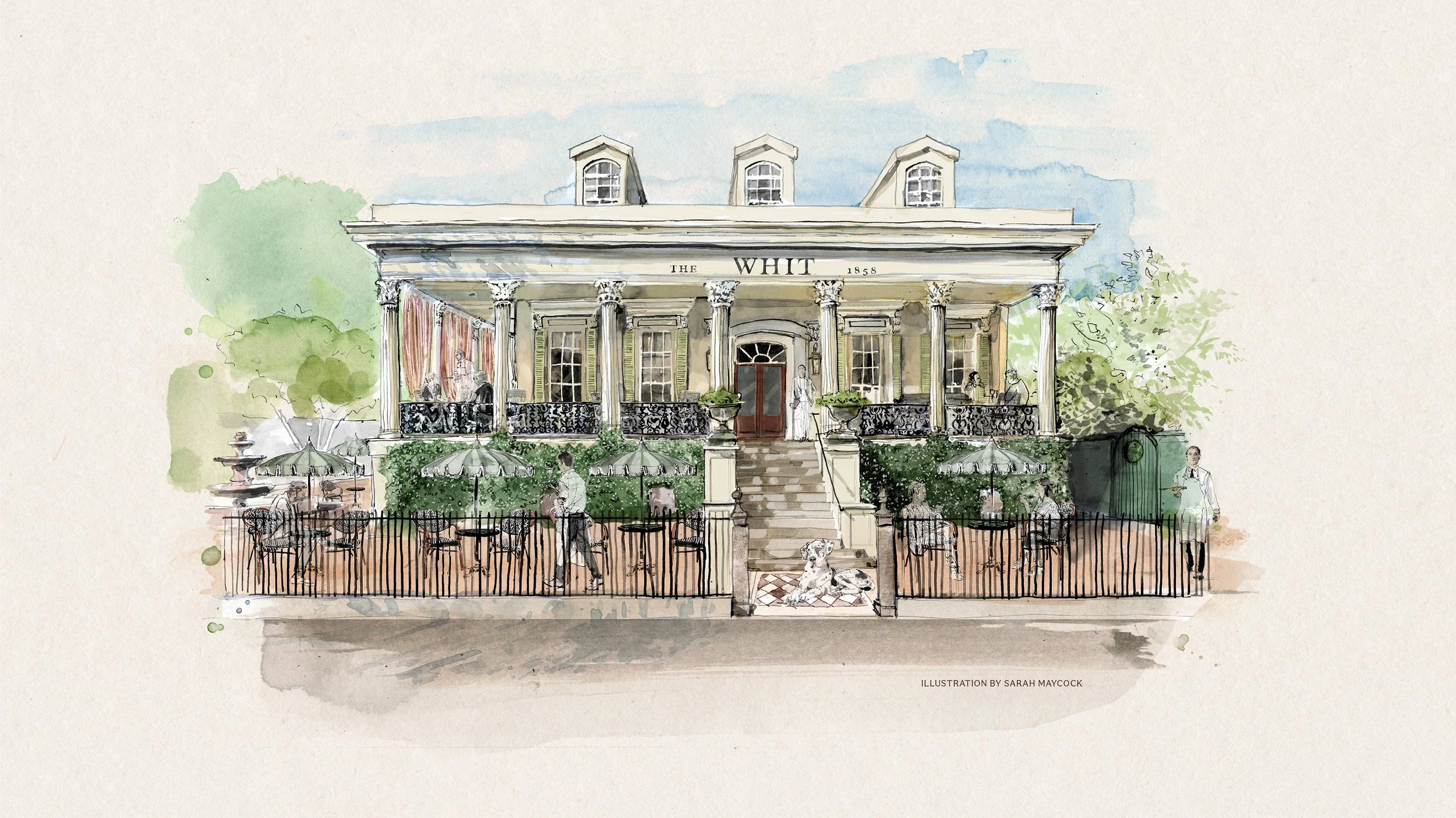
Sarah Maycock, Architectural Illustration
Collin Findlay, Photography
SCOPE
Brand Development:
Market Research
Positioning
Brand Identity:
Naming
Messaging
Logo Design
Custom Illustration
Brand Guidelines
Brand Assets:
Website Design + Content
Print + Digital Collateral
Presentation Design
Signage + Wayfinding
Email Marketing
The Opportunity
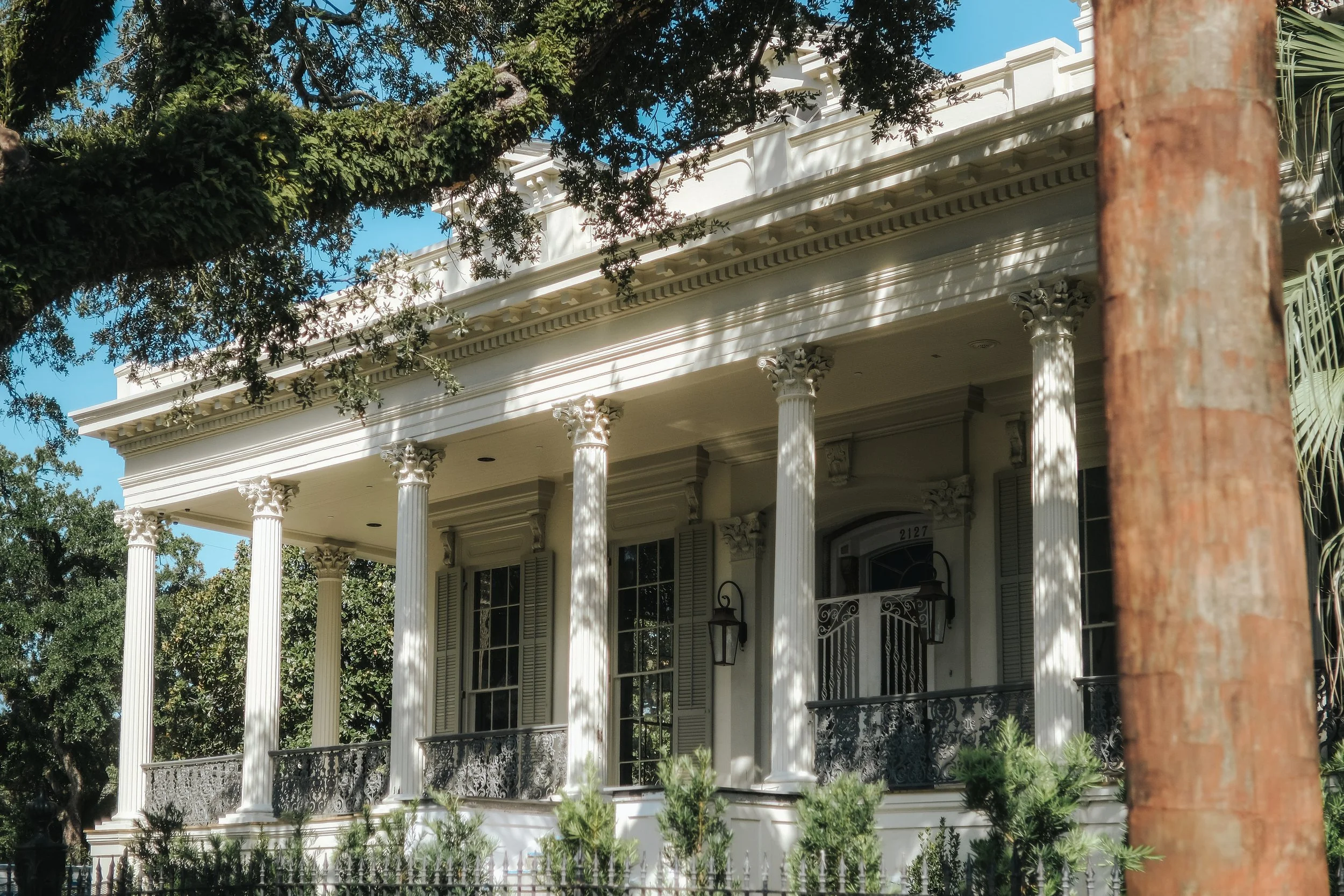
While noteworthy boutique hotels and cocktail concepts abound in New Orleans, the eye-catching event spaces and gardens of this historic property offered a unique opportunity to connect with local clientele. Eschewing a local tendency toward eclectic or baroque aesthetics, the goal was to provide a more restrained version of old-world elegance, gesturing towards a “member’s club” ambiance (without the associated pretension).
The Challenge
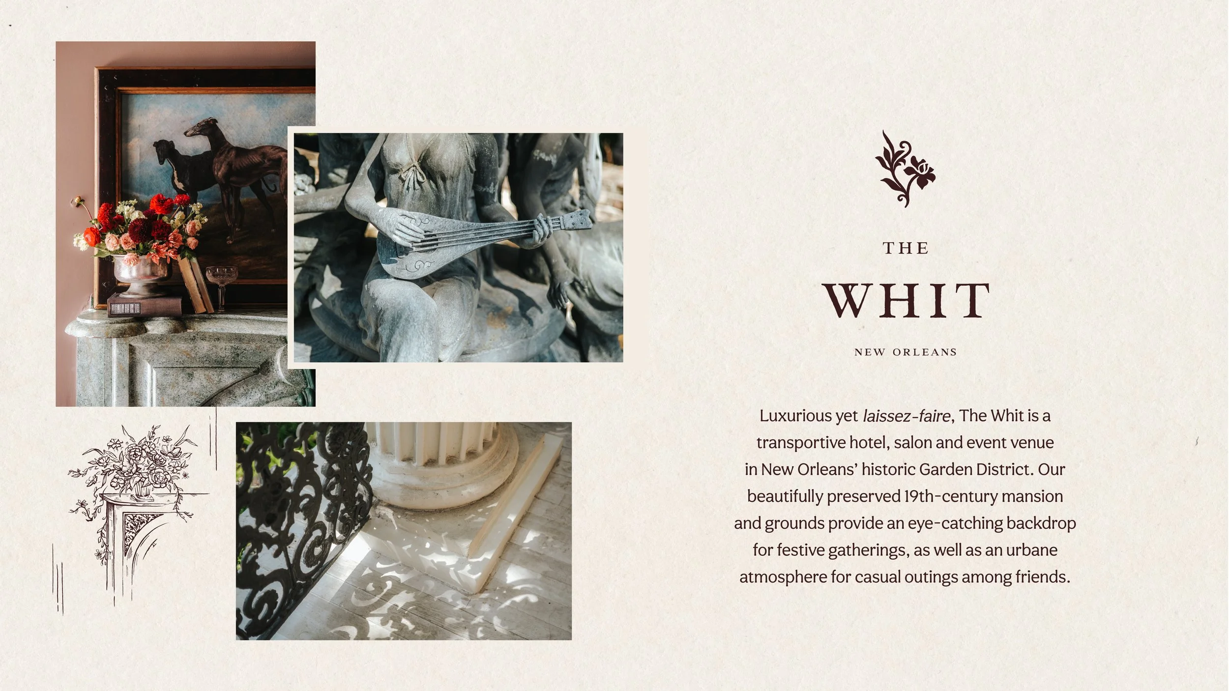
As with many historic properties, The Whit had changed hands several times over the course of its life, most recently operating as a mismanaged hotel. Our branding efforts sought to draw inspiration from the era and context in which the building was conceived, without drawing associations to any of the previous owners or inhabitants. In addition, for the concept’s coffee, tea and cocktail salon to be frequented by New Orleans locals, a sense of approachable elegance needed to balance the imposing stature of this Greek Revival mansion.
The Name
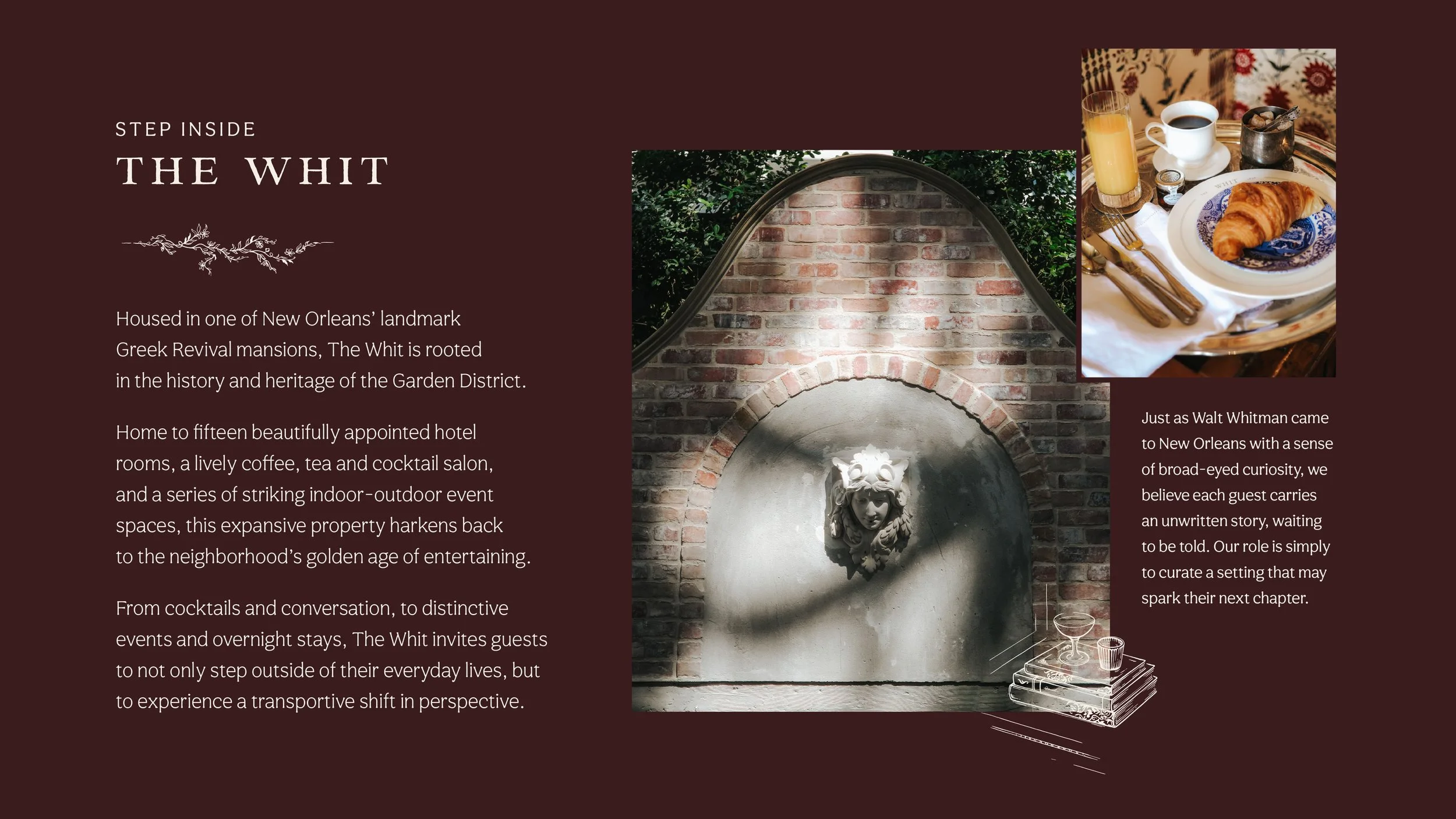
Much of New Orleans’ history and culture has already been mined for the development of other hospitality concepts, so we narrowed our research to the founding era of Lafayette City (the modern Garden District). From there, our research delved into both the history of the residence and other colorful anecdotes from the mid-1800s era in New Orleans. That led to the discovery that Walt Whitman’s seminal work, Leaves of Grass, was largely influenced by his brief sojourn in the city, including his particular fondness for the lush plantlife of the Garden District. The choice of this name also shaped the owners’ intentions for the guest experience, drawing broad inspiration from Whitman’s poetry.
The Logo
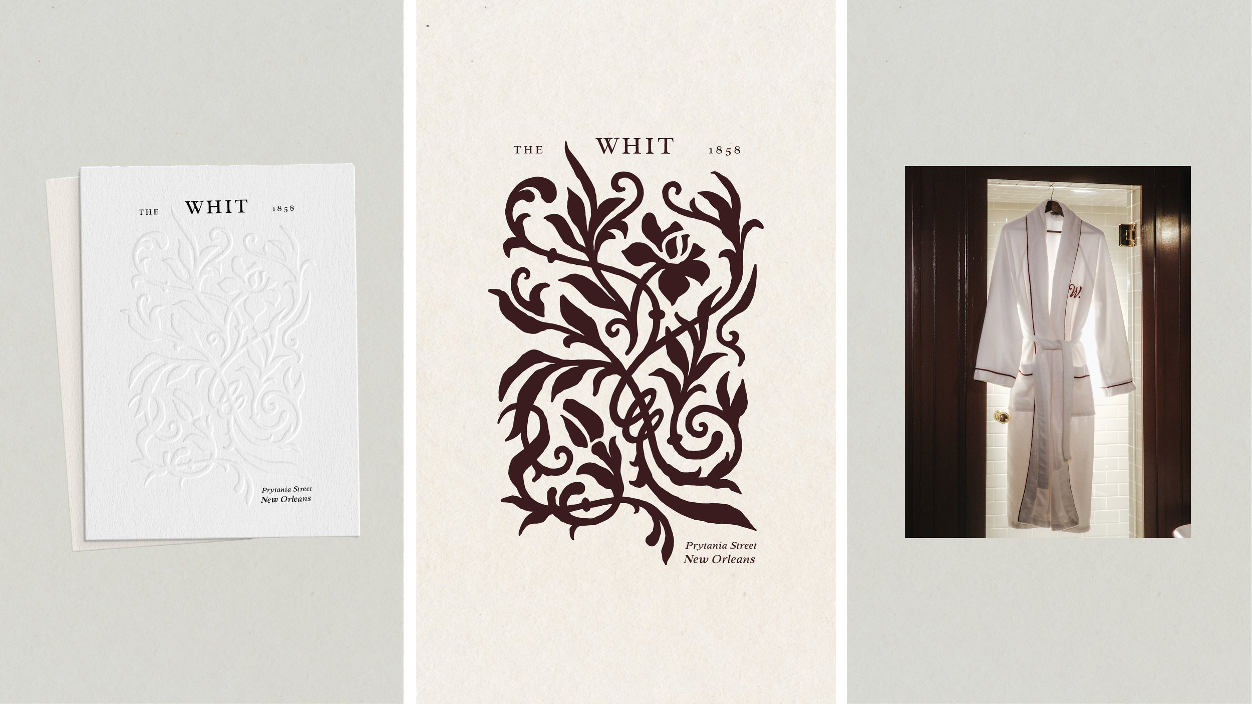
Building on the literary origins of the property’s name, our logo illustration draws from the tradition of “ex libris” bookplates, while aesthetically referencing the iconic wrought iron fences of the Garden District. Within these winding vines, we also included a hidden illustration of a single magnolia blossom—inspired by prominent trees on the property—which doubles as a smaller logo mark.
The Illustration
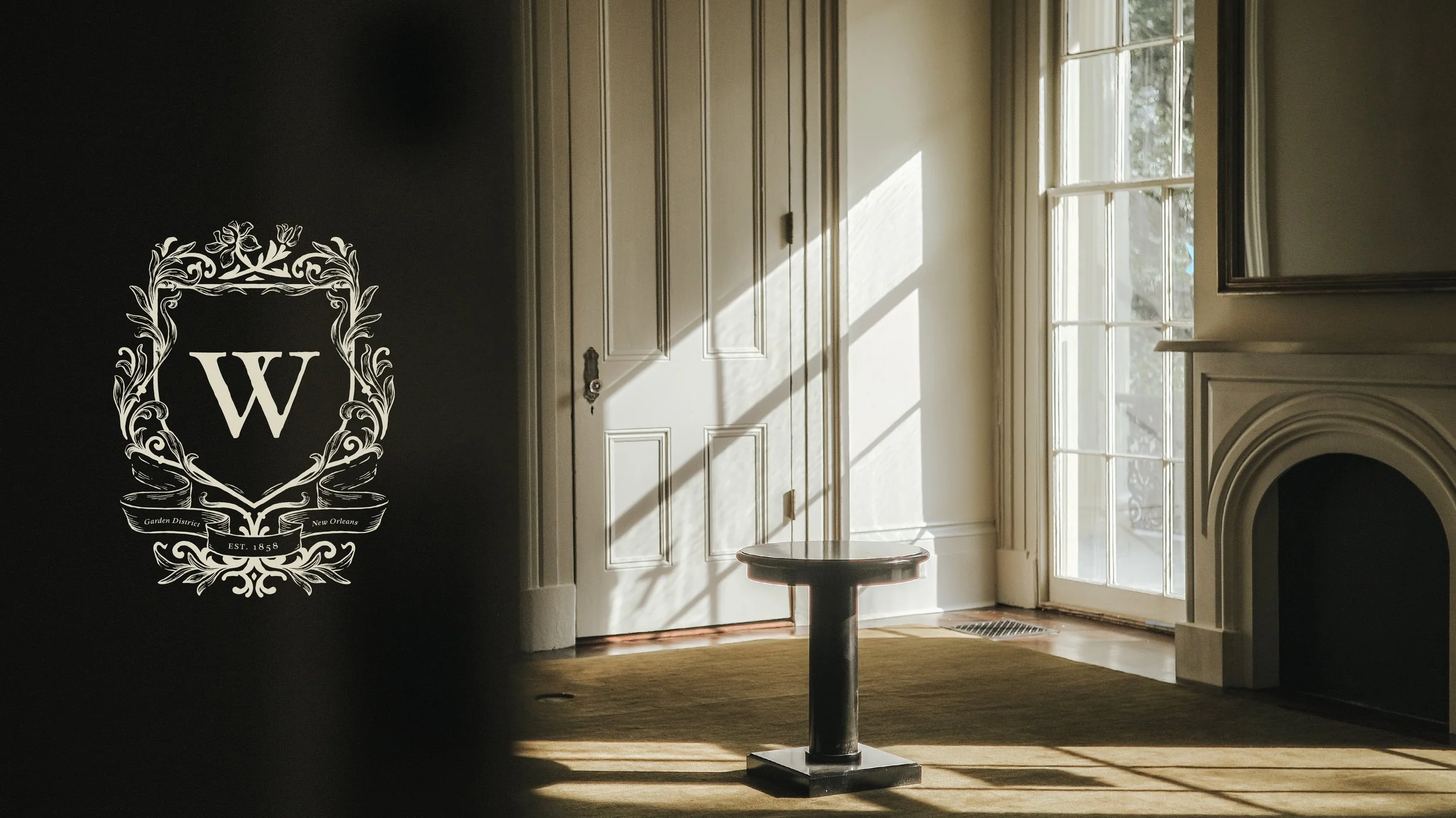
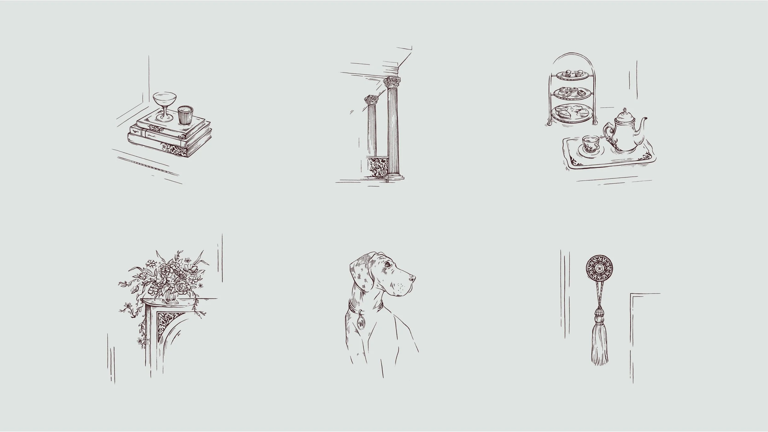
As the property moved closer to opening, we built on the initial design work with the creation of a custom property crest as well as several “vignettes” from the property, showcasing noteworthy architectural, interior or landscaping details alongside moments of whimsy within the guest experience.
Marketing + Press Outreach
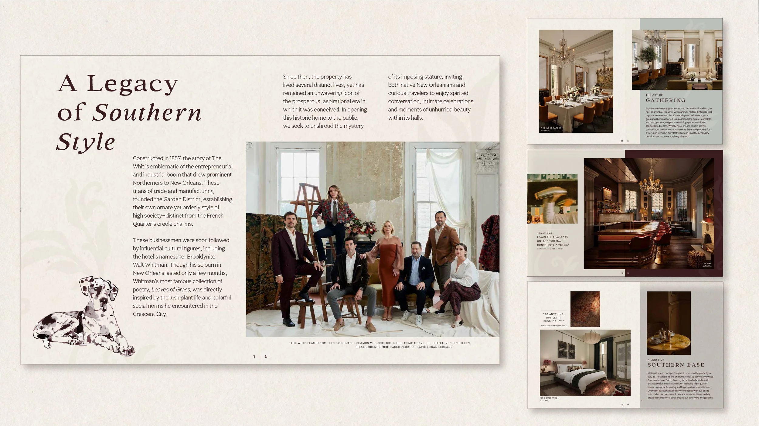
Having developed a deeply intentional, transportive approach to their onsite guest experience, the client looked to extend that ethos into a range of digital communications. Our work first began with the development of an editorial-style booklet for media outreach, offering a differentiated strategy from traditional press pitching. On the guest side, we also developed evocative newsletter sign-up and booking confirmation emails that begin to spark guests' imaginations and draw them into the possibilities for their on-property experience.