

Waymark Outdoor Design
THE BRIEF
Support a holistic rebrand for the new owners of an award-winning landscape design firm. Build credibility through the company’s 25+ years of experience and network of trusted contractors, while establishing a renewed focus on the boutique scale of the firm and regional specialization as market differentiators. Elevate the overall aesthetics and storytelling of the brand, in service of a more luxe and engaging client experience.
LOCATION
Denver, Colorado
COLLABORATORS
Genghis Kern, Letterpress
SCOPE
Brand Development:
Market Research
Positioning
Brand Identity:
Naming
Tagline
Messaging
Logo Design
Custom Illustration
Brand Guidelines
Brand Assets:
Website Design + Content
Print + Digital Collateral
Photography
Signage
Email Marketing
The Opportunity
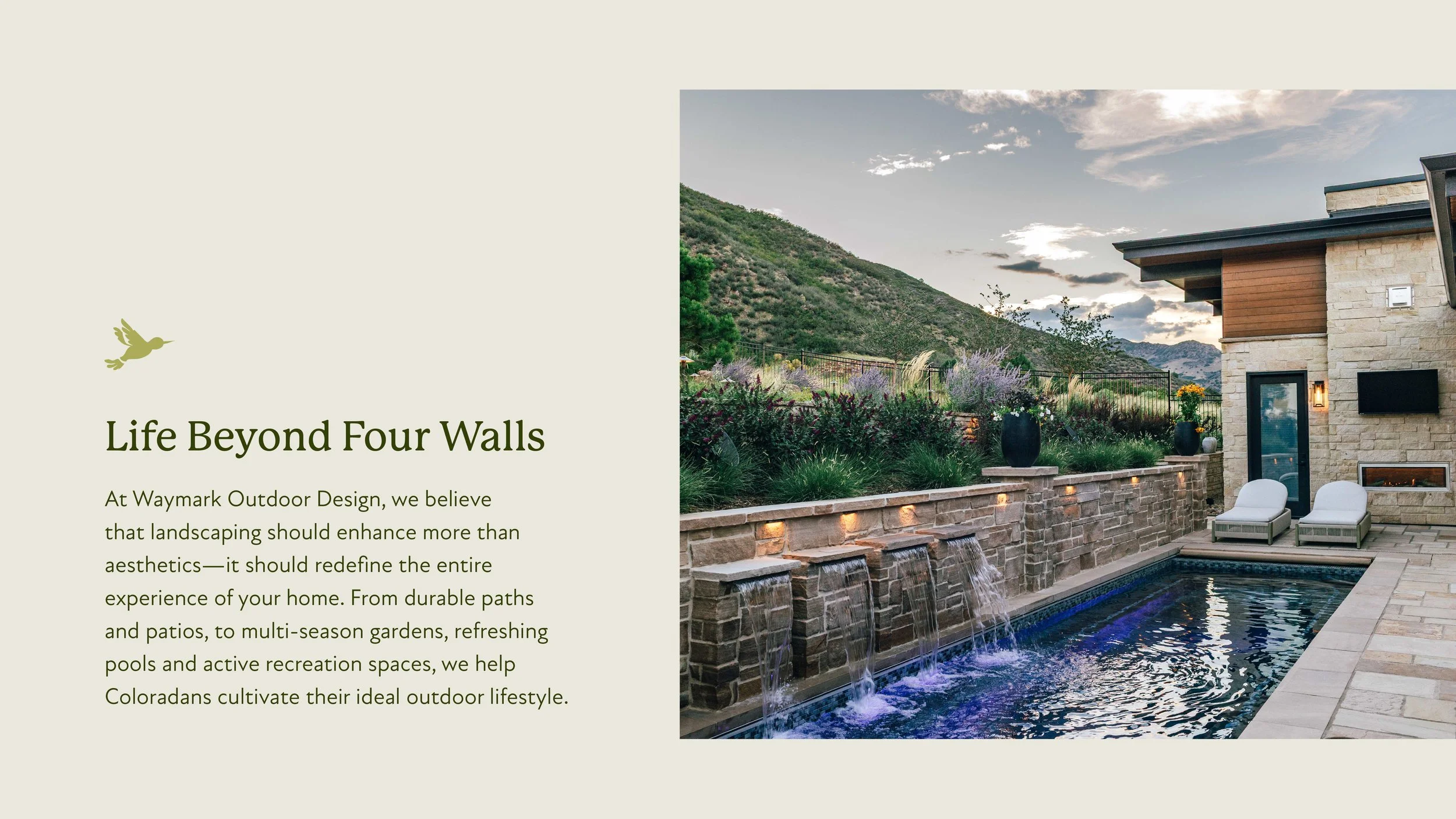
After purchasing, Browne & Associates—a Denver landscape design firm—owners Zach and Stephanie saw an opportunity to enhance the client experience. With backgrounds in financial advising and team leadership, these two entrepreneurs brought significant business skills to the project, seeking our input as creatives to support their thoughtful, boutique services. By leveraging our hospitality experience in analyzing and addressing the market, we were able to craft a thoughtful, elevated brand experience that establishes a sense of quality and trust throughout the sales and marketing process.
The Challenge
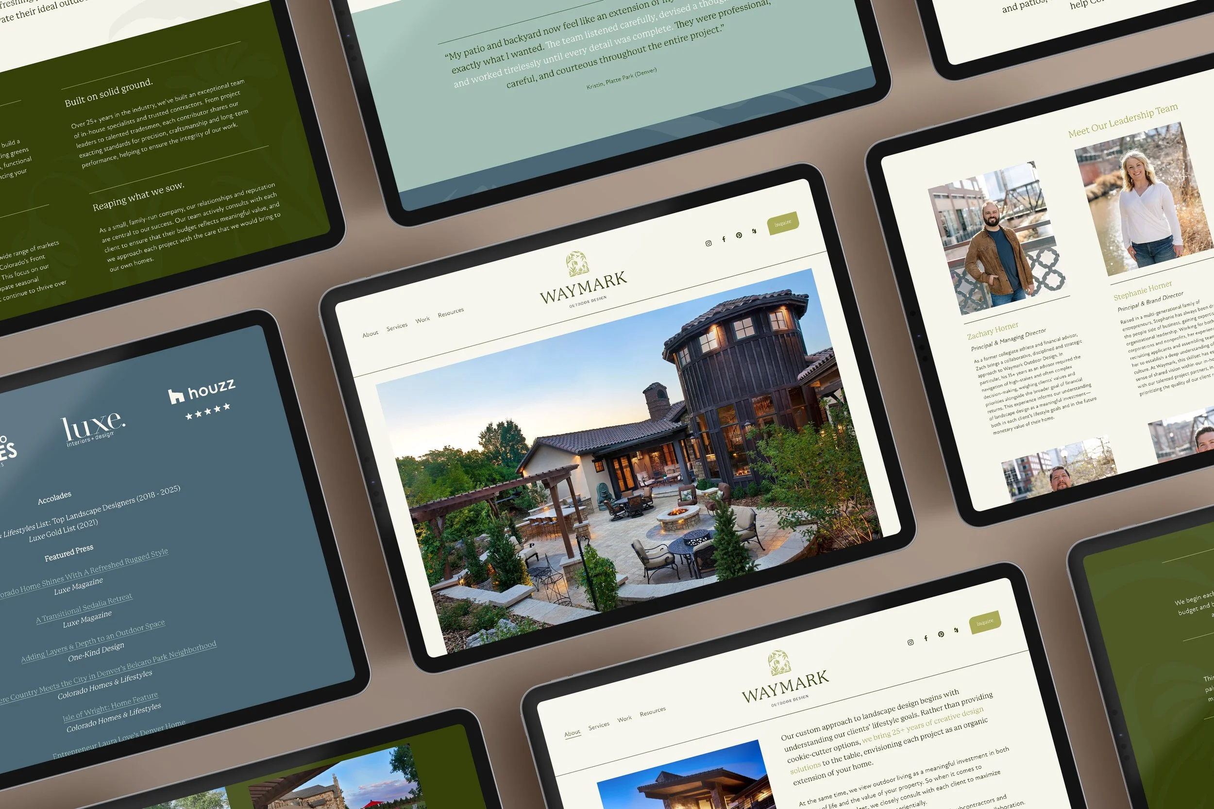
None of the work executed by the previous business owner had been properly documented, leaving our team to get creative with the process of building a portfolio. Through evocative copywriting and thoughtful web layouts that made the most of limited project details and photography, we helped the new owners establish a set of case studies that reflect the kinds of projects they hope to attract in the future.
The Name
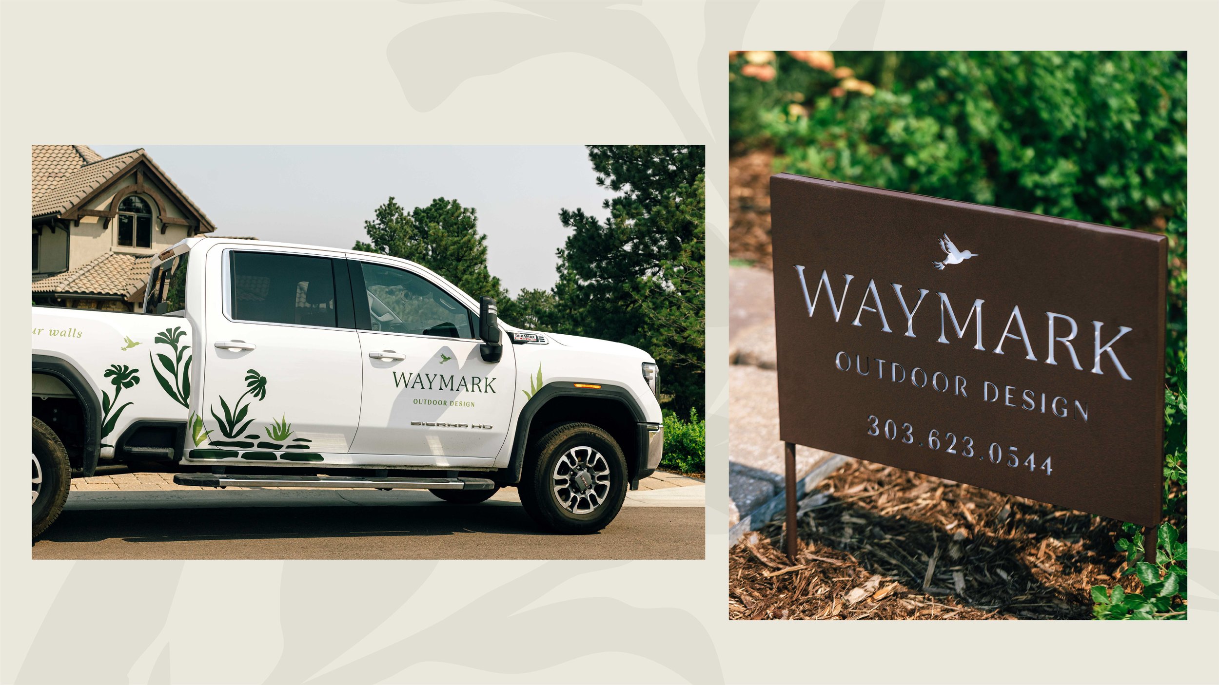
We were asked to develop a more modern, relevant business name that would reflect the level of taste and client services that differentiate the brand’s work. After exploring several creative directions, the word “waymark” stood out for its reference to stonework and structural architecture, while “outdoor design” (as opposed to “landscaping”) conveyed a sense of the lifestyle transformation their holistic site plans provide to clients. The name also draws from associations with wayfinding, indicating the thoughtful strategy and careful consideration the team brings to executing each client’s project goals.
Print Collateral + Photography
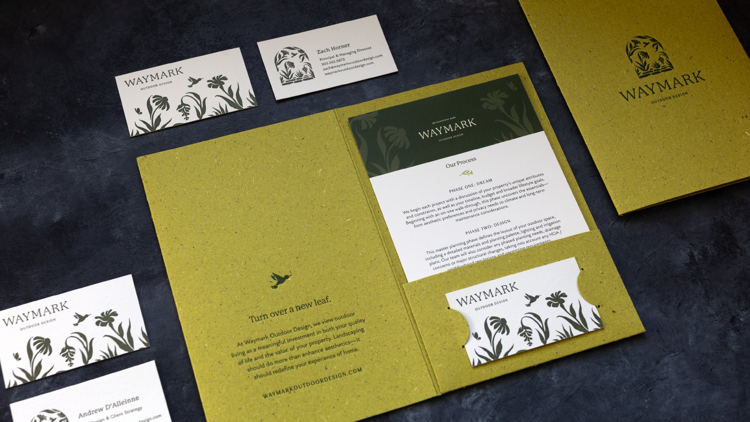
To support the Waymark team’s ongoing sales and marketing efforts, we developed a custom folder focused on their portfolio and process. Utilizing Gmund Bio Cycle paper made from recycled plant fibers and grass, the letterpress folder already begins to tell a compelling story about the level of care and attention that the team brings to their work. Within, a consistent, yet customizable set of assets allows for each folder to be adapted to the interests of the client in question.
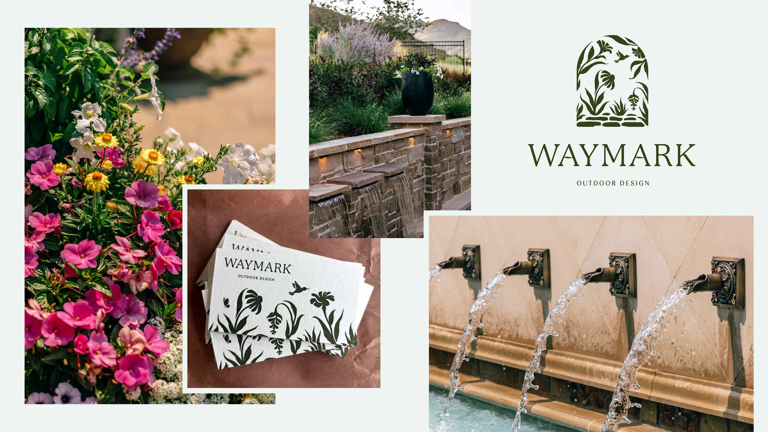
We also bolstered the quality of Waymark’s online portfolio through strategic storytelling and photography. By capturing both establishing shots and “moments” that capture the brand’s experiential emphasis on outdoor living, we’ve been able to shift the visual tone of the brand toward a more elevated, editorial aesthetic.
KIND WORDS
“Working with Cognoscenti Creative has been one of the best decisions my wife Stephanie and I have made for our business. From the very beginning, the experience felt thoughtful, intentional, and genuinely collaborative — not transactional or cookie-cutter in the slightest.
Lauren and Carly are exceptional. Not just talented creatives, but true partners in the process. They took the time to deeply understand who we are, where our business came from, and — most importantly — where we’re going. The result wasn’t just a “rebrand,” but a complete elevation of our identity, voice, and vision. Everything they delivered felt aligned, refined, and purposeful.
What stood out most was how much they cared. They asked the right questions, pushed us when it mattered, listened when it counted, and translated abstract ideas into something tangible, cohesive, and powerful. The process felt organized yet inspired, professional yet personal — a rare balance. We genuinely enjoyed working with them. Every meeting felt productive. Every deliverable exceeded expectations. And the final result is something we’re incredibly proud of and excited to build upon.
If you’re looking for a creative team that brings strategy, taste, clarity, and heart to their work — Cognoscenti Creative is it. Five stars without hesitation. Higher if that were an option.”