
Cognoscenti Quarterly: Branding as Expectation Setting
For many business owners, branding is an aspirational exercise that begins by looking outside of their company for ideas, focusing moreso on what they hope to be than what they actually are. Yet at Cognoscenti Creative, our branding process begins by looking inward, building a compelling brand that is firmly rooted in the reality of each business.
The benefit of this introspective process is that it extends far beyond a logo or an aesthetic, establishing an enduring strategic framework. Through positioning and messaging that holistically align with visual identity, we help clients define how they think and speak about their business and, ultimately, what their guests and customers can expect from any interaction with their company.
As a result, our brand work sets the stage for appreciation and delight, rather than misunderstanding or disappointment. To us, this is the essence of hospitality, ensuring that clients both attract customers or guests who will resonate with their offerings and that they can fulfill the experience promised by their brand marketing.
In this issue of the Cognoscenti Quarterly, we highlight two comprehensive, multi-year projects—both of which are firmly rooted in the question of aligning branding with the lived guest or customer experience. If this approach resonates with you and your business, we’d love to hear about your next project. Submit a project inquiry to start the conversation.
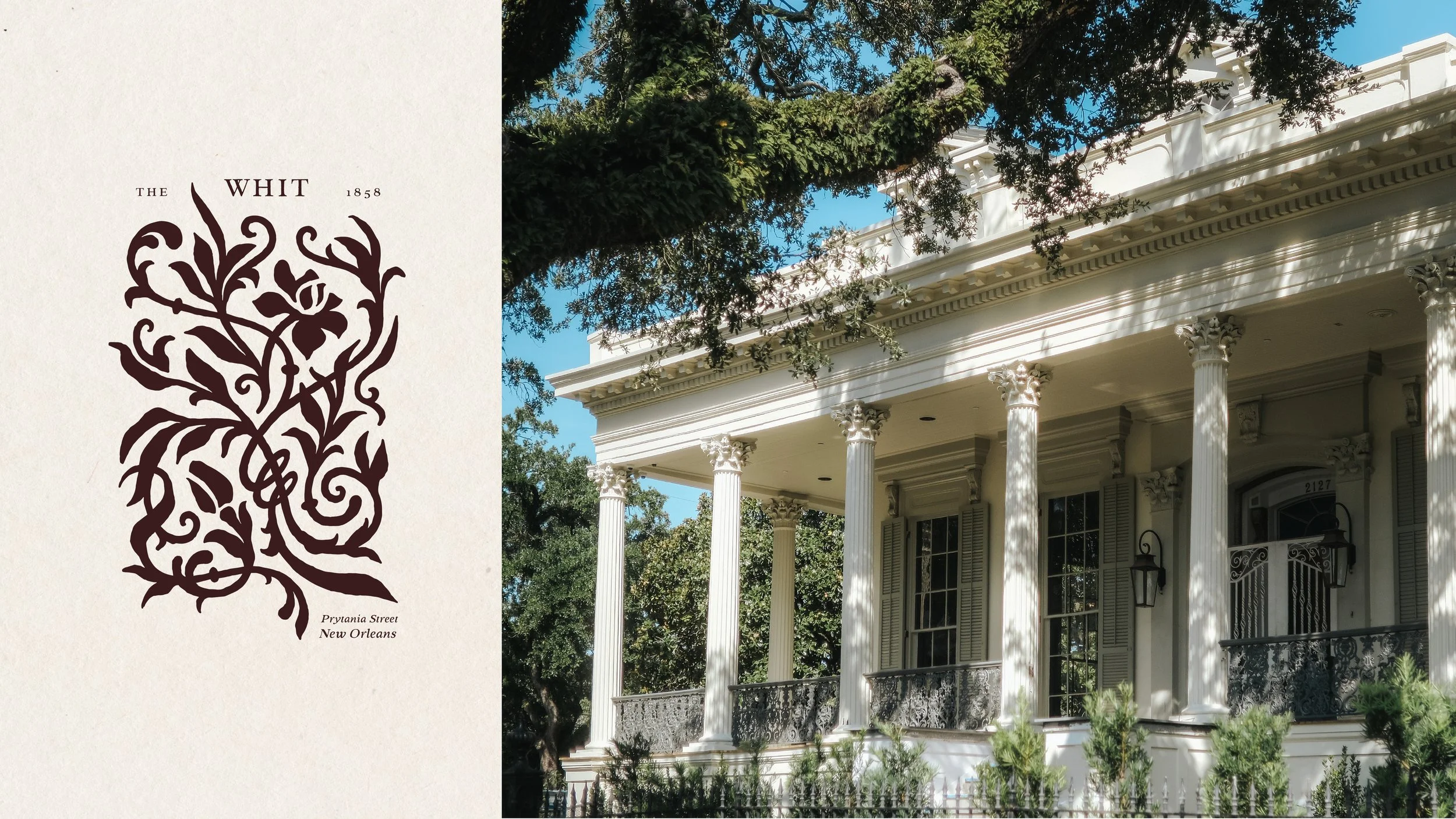
THE WHIT
New Orleans, Louisiana
Brand Positioning, Naming, Logo Design, Messaging, Website Design + Content, Collateral, Signage + Wayfinding, Email Marketing, Presentation Design
This project embodies the ethos that brand experience can be as robust as the in-person experience. We believe that hospitality shouldn’t wait for the moment a guest arrives on-property; it begins the moment they first encounter your brand.
Envisioned as an event venue, boutique hotel and coffee / cocktail lounge in a landmark 1800s mansion, the challenge of The Whit was to capture a distinctive sense of elegance, while avoiding a museum-like reverence for the property. With “approachability” in the purest sense feeling a bit off-brand, we instead focused on fostering a sense of curiosity and discovery.
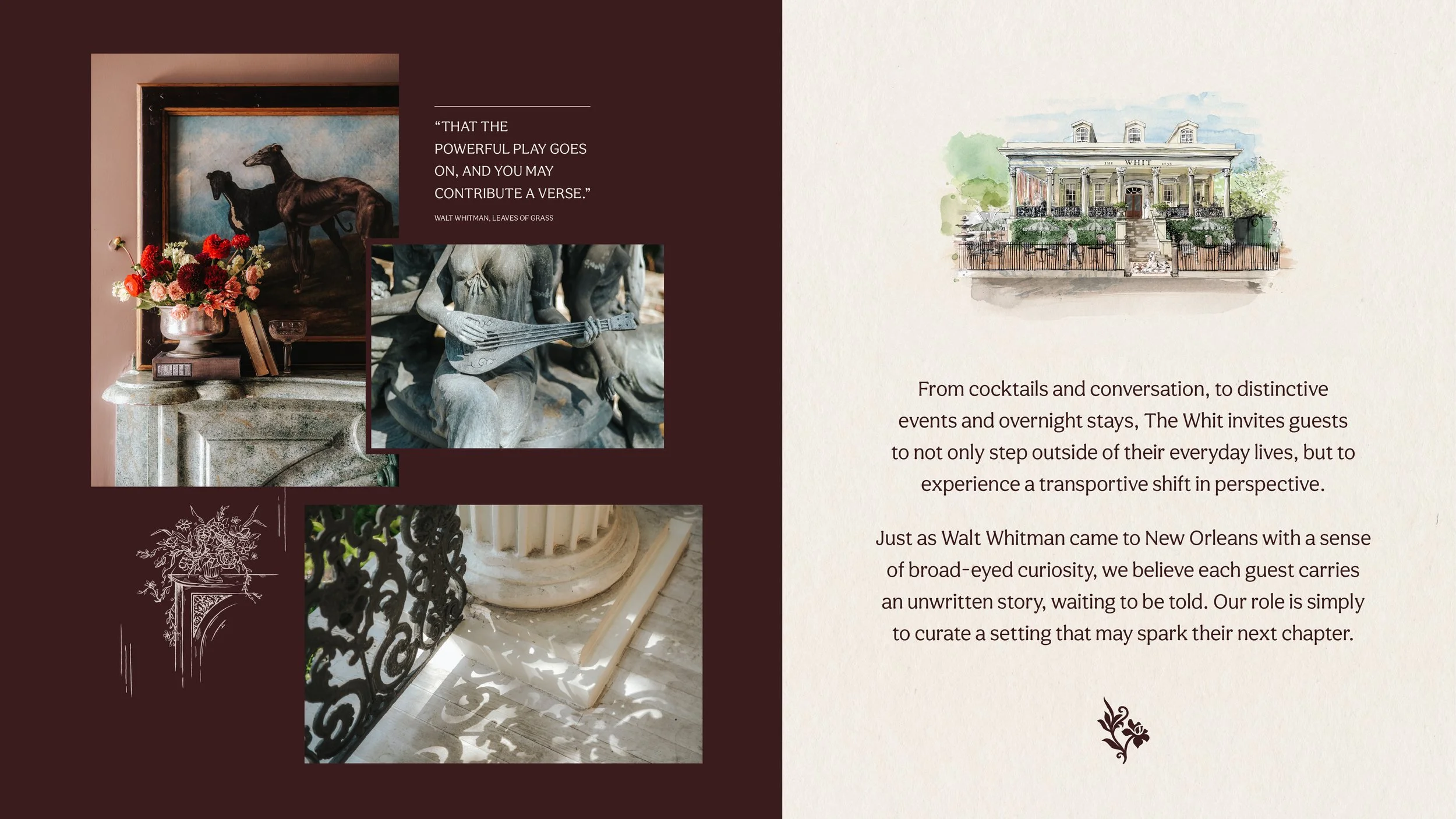
This creative direction was first embodied in the name we developed for the property, inspired by Walt Whitman’s brief, but influential sojourn in New Orleans. We also took inspiration from the Northern industrialists who founded the Garden District, who would have prized books and learning as elements of social stature. These literary influences informed our ex libris-inspired logo design, which also nods to the iconic wrought iron gates found throughout the neighborhood.
As our work on the brand expanded, this creative direction inspired a larger series of custom illustrations, capturing noteworthy “moments” from a stay at The Whit. The visual identity also grew to include a layered, editorial- and collage-inspired approach to digital brand layouts—bringing a sense of the handmade and human curation to all sales and marketing assets. As the property moves toward its long-awaited fall opening, we’ve continued to bring this level of thoughtful detail to such practical elements as room descriptions, booking confirmations and wayfinding.
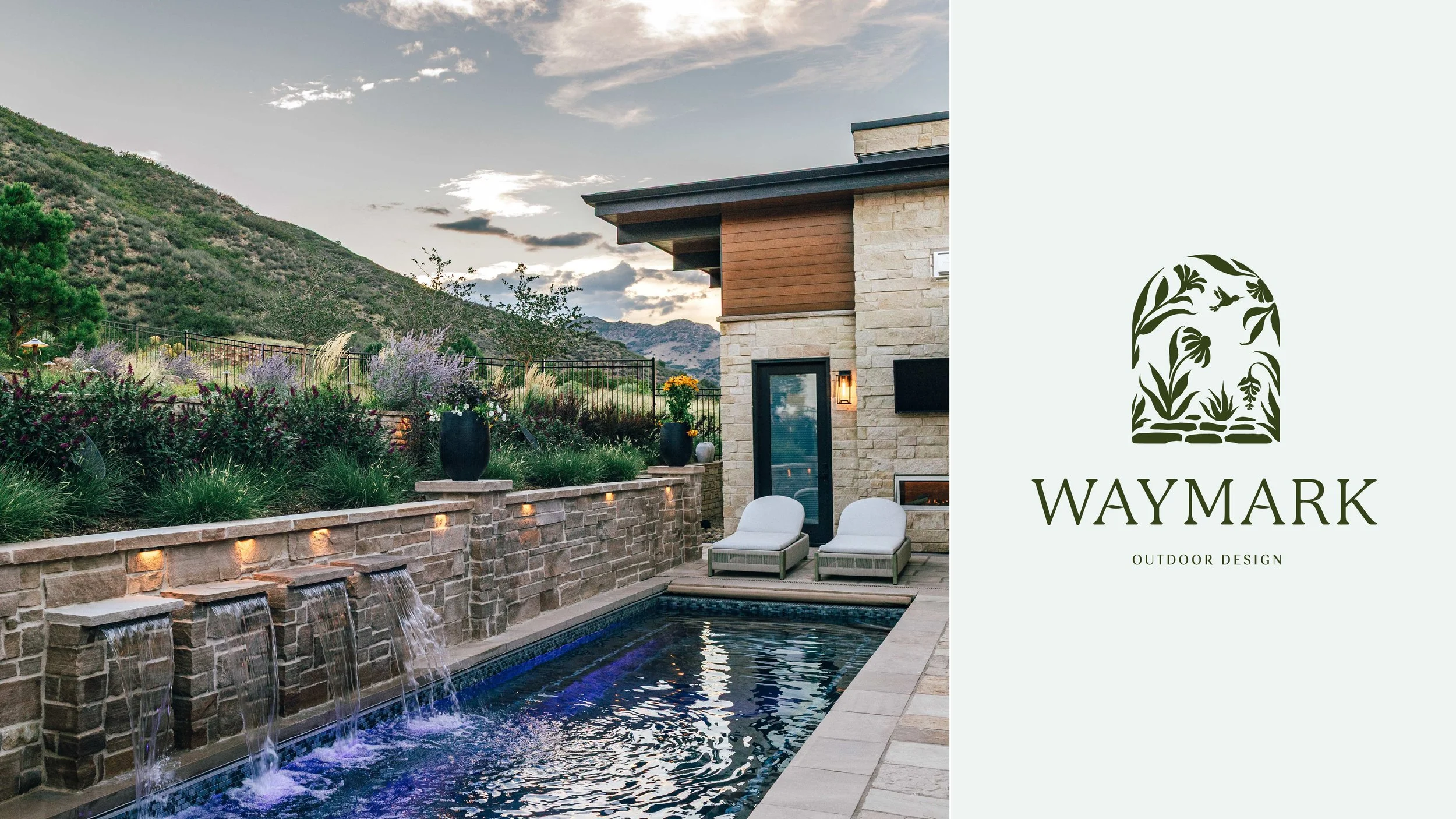
WAYMARK OUTDOOR DESIGN
Denver, Colorado
Brand Positioning, Naming, Logo Design, Messaging, Website Design + Content, Collateral, Brand Experience, Email Marketing, Lifestyle Photography
This collaboration has deepened our conviction that hospitality isn’t limited to the world of restaurants and hotels. Instead, we believe the essence of hospitality lies in a sense of intention and connection that can be brought to any human-facing, service-oriented business.
After purchasing a legacy landscape design business, Waymark’s new owners were seeking to differentiate their brand with an emphasis on elevated client services and a more experiential perspective on outdoor living. Our strategy was to move beyond the more transactional expectations of a client-contractor relationship, developing engaging imagery and messaging that spoke to a boutique, family-owned business and a skilled approach to transforming each client’s lived experience of their home.
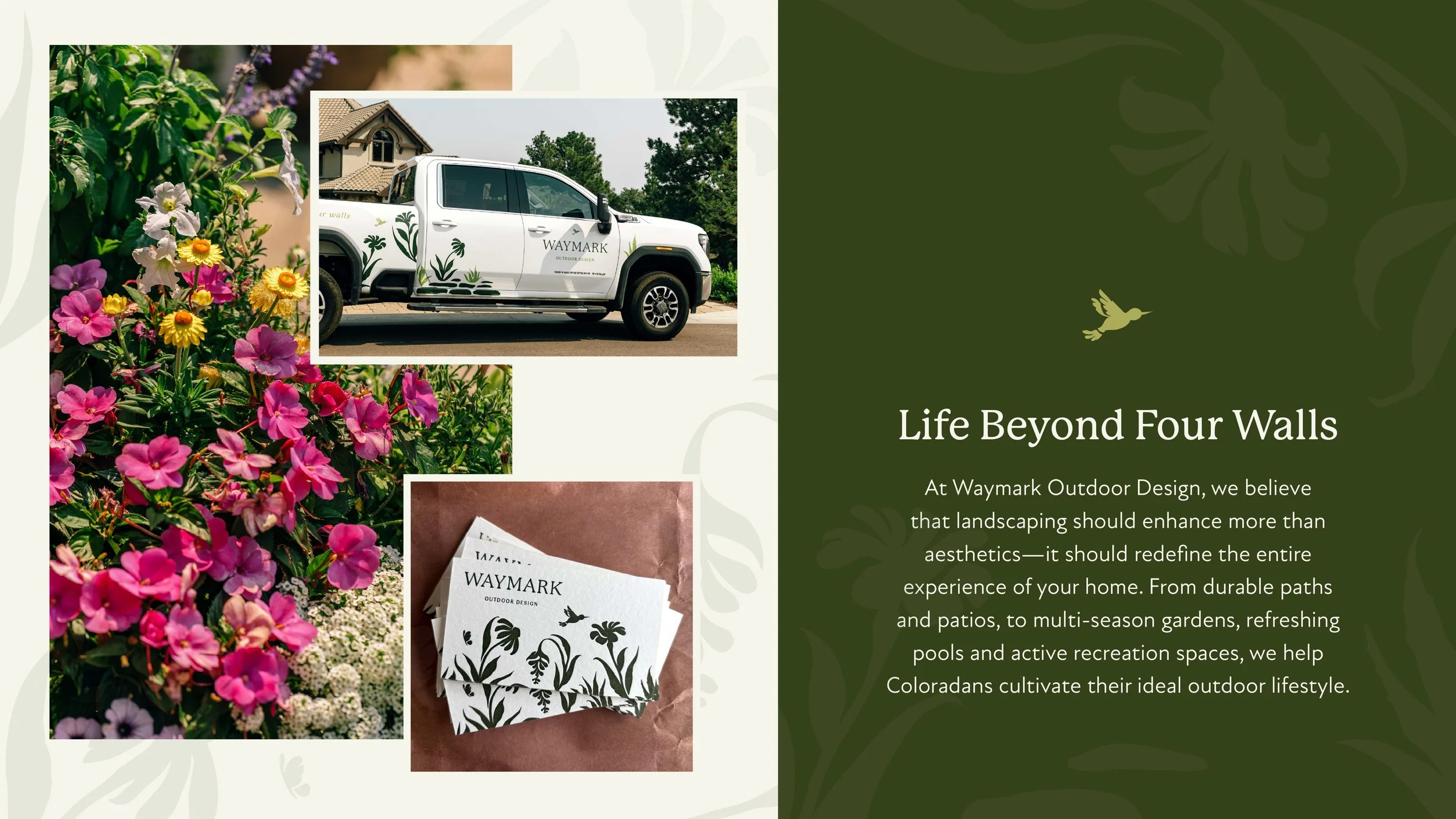
Our naming process sought to emphasize elegance, reliability and skilled technical work, with “Waymark” nodding to stone paths and structural hardscaping. We then paired this sturdy name with a series of playful, engaging taglines—leading with “life beyond four walls”—and a garden-inspired illustration style that emphasizes the experience of outdoor living.
These core assets were then leveraged to create bespoke printed materials, elegant truck wraps, editorial-inspired photography and high-value email content, with the goal of demonstrating good taste and attention to detail across all sales and marketing channels. These assets have not only drawn the attention of prospective clients, but have also helped Waymark’s owners network with respected architects and designers in their target markets.
CULTURE STUDY ⊹ Naples, Italy
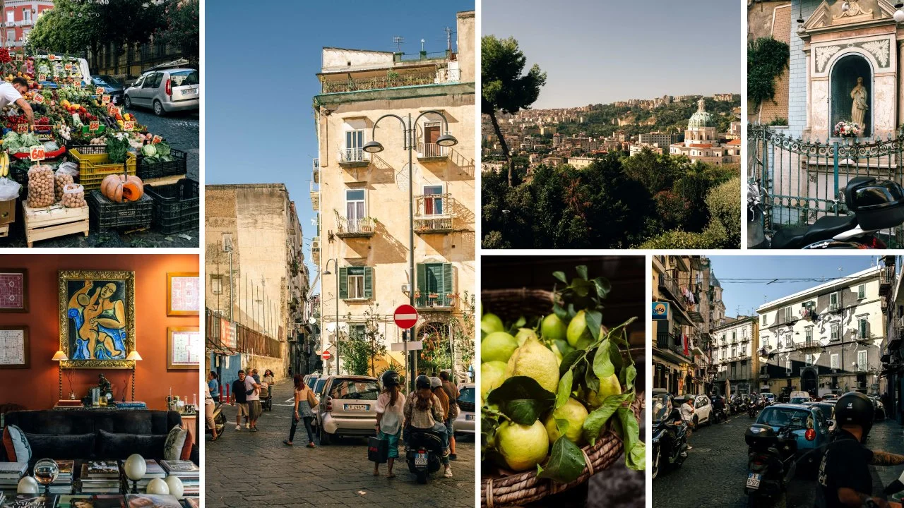
Energy sizzles off the streets of Naples, with pedestrians brazenly battling for space alongside Vespas and a “nosey neighbor” culture that makes for legendary people-watching. Yet this overwhelming intensity is juxtaposed with breathtaking moments of beauty and some of the warmest hospitality we’ve ever witnessed. Our family hails from nearby Amalfi, making this the “big city” of our ancestors’ upbringings—and the port from which they departed for America. So when researching hotels, we were looking (as we always do) for a distinct sense of place in an undeniably local district. We were immediately drawn to Casa D’Anna ai Cristallini: a restored 16th century “art house” residence in the infamous (and increasingly hip) Rione Sanità. Perfectly balancing a sense of independence with a warm welcome from the owner, Alessandra, and daily aperitivo hours with the staff, our stay—like so much of Naples—was a delightful detour from the city’s gritty reputation.
WORK IN PROGRESS ⊹ Evergreen, Colorado
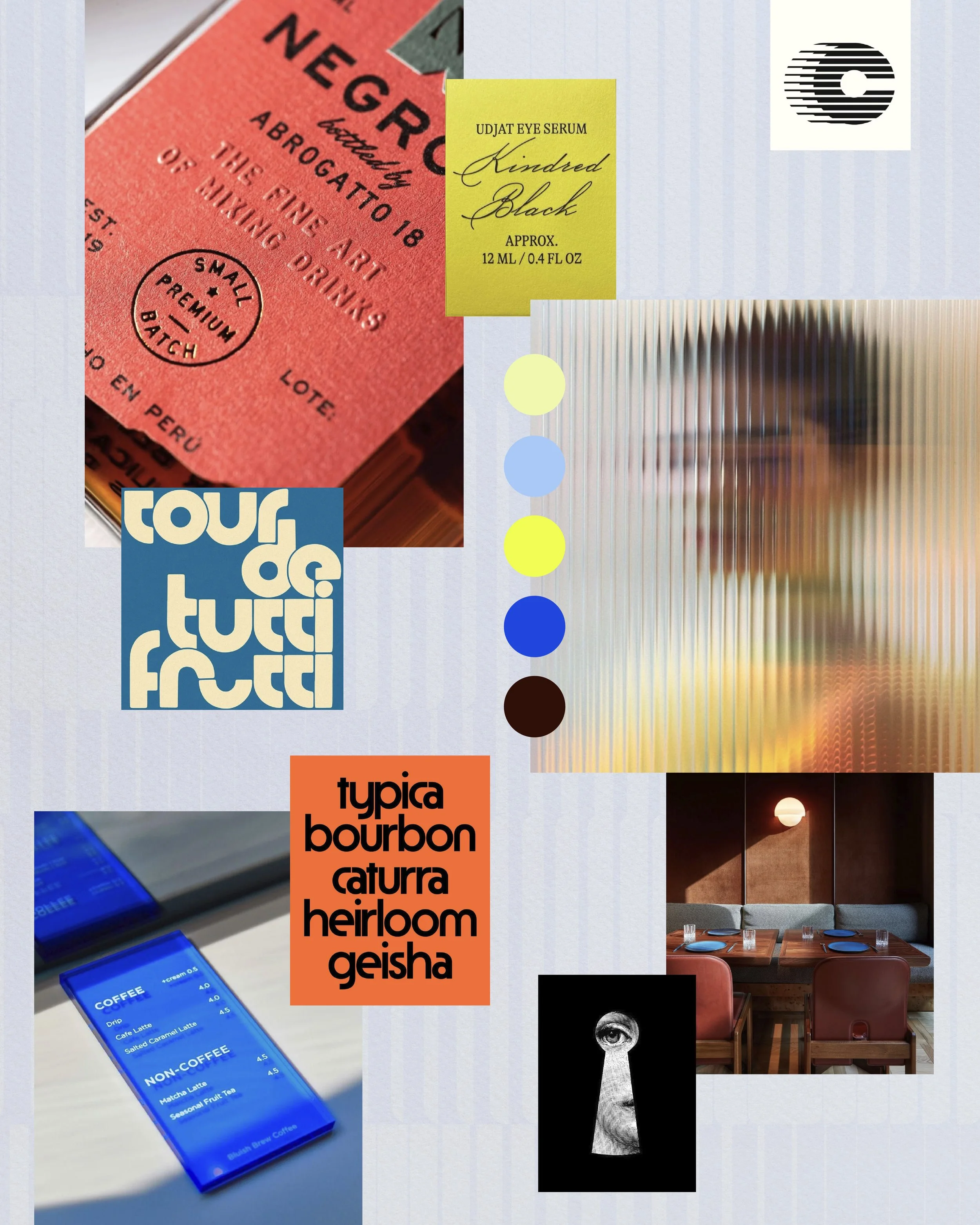
We’ve been quietly developing the brand for a very exciting new F&B concept in the Foothills—a collaboration with two incredibly thoughtful and creative hospitality entrepreneurs. Drawing from retro signage, intriguing architecture and a color palette that pops, this concept upends the traditional aesthetic of mountain town hospitality (in the best possible way). Best of all, this multi-faceted concept creates space for meaningful community and connection, so get ready to settle in and stay longer than you planned.
RECENT PRESS ⊹ Mile High CRE
We were thrilled to have our work in Colorado’s hospitality market featured in Mile High CRE! The article focused on the shift from branding as an “afterthought” in the development process, to leveraging brand as an overarching source of aesthetic and operational direction.
ON OUR BLOG ⊹ Aligning Brand with Interior Design
We also recently teamed up with one of our favorite Denver-based designers to talk about the intersection of brand and interior design. If you’ve been wondering how to foster greater cohesion and collaboration within your creative team, this is a must read!